A user-friendly ecommerce website for a high-end furniture brand.

Design Thinking Process guides this project through Empathize, Define, Ideate, Prototype, and Test & Iterate to create user-centered solutions.
An Overview
Lorem Ipsum is simply dummy text of the printing and typesetting industry.
Lorem Ipsum is simply dummy text of the printing and typesetting industry.
Lorem Ipsum is simply dummy text of the printing and typesetting industry.
Lorem Ipsum is simply dummy text of the printing and typesetting industry.
Discover
I opened the discovery phase with a set of "How might we… "questions, using them to narrow the problem into clear guidelines that would later drive the design. They anchored on a single problem statement: An adult living in the city needs to re-furnish her home but prefers to shop online, comparing products for the most affordable option before buying. She values her time, but finds online furniture shopping frustrating and inefficient. A competitive analysis of three rivals — Indigo Living, Inside, and Staunton & Henry — surfaced the key opportunity. All three sell upmarket furniture online, but their sites are cluttered and lack obvious direction, with too many competing elements and too little white space for the eye to settle on a task. They work as inspiration boards, but not for getting things done efficiently. That gap — sophisticated products trapped in an inefficient experience — became Tequila Kola's point of difference: clear direction from the moment you arrive, and a tailored path rather than an overwhelming one.
Ideate
I built the design around Rachel, an expat working mother in Hong Kong. She earns well but is time-poor, task-oriented, and price- conscious rather than brand-sensitive — a customer who wants guidance, not an endless catalogue. Crucially, Rachel shops on desktop, comparing products across multiple sites from a stationary spot at home. That persona drove a deliberate platform decision: desktop-first, not mobile. Furniture shopping isn't a task done on the go — it takes time, focus, and side-by-side comparison across tabs, all of which a small screen constrains. Designing mobile-first would have limite access to content and made comparison slower, so I designed for the context customers actually shop in. A customer journey map then traced Rachel's path from arrival to purchase, keeping the design honest about where friction needed to disappear.
Design
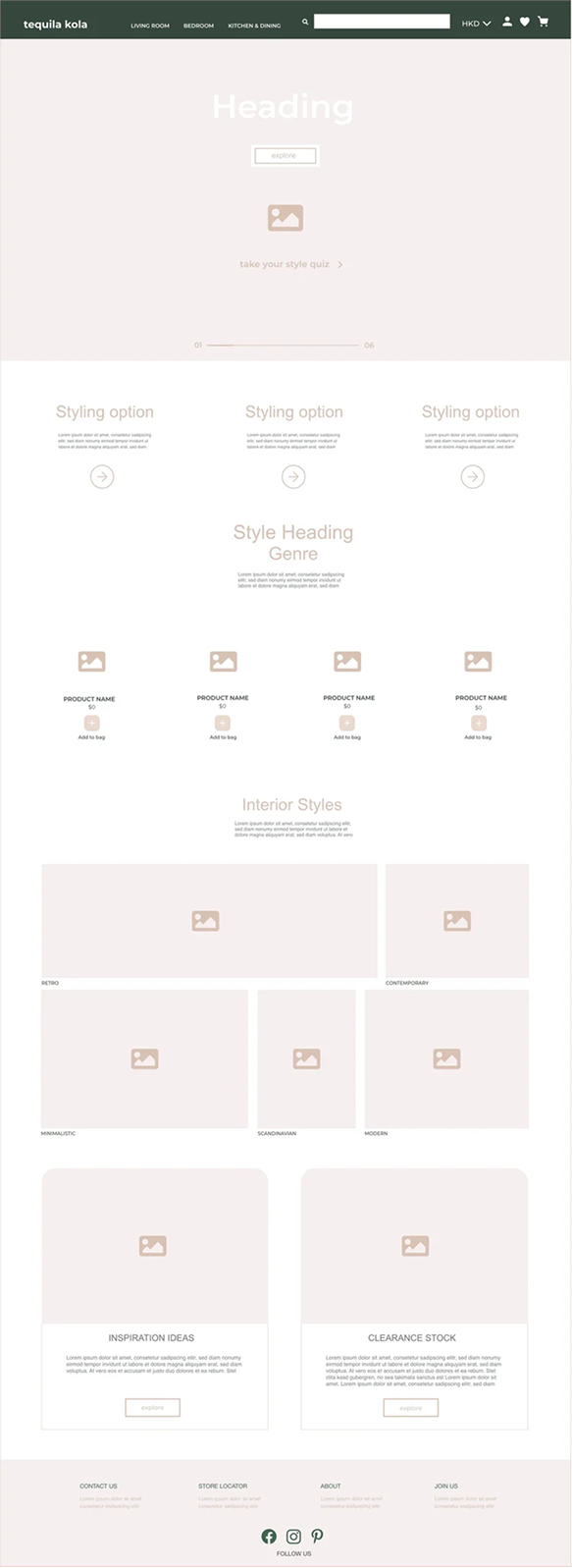
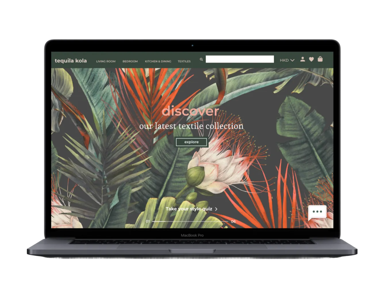
Wireframes came first — several layout experiments tested against a grid to keep pages congruent, leaning on white space to let products breathe. The style guide followed. My competitive analysis had shown high-end furniture sites gravitating toward muted, pastel palettes, so I chose a muted canvas that lets the furniture and upholstery speak for themselves, with a deep emerald green as the primary accent for the navigation bar and category headings. Soft pinks, stone, and cream fill footers, dropdowns, and buttons — drawing attention to actions without competing with the imagery. Muted tones plus generous white space were the foundation of the sophisticated feel the brand needed.
User personas
.png)
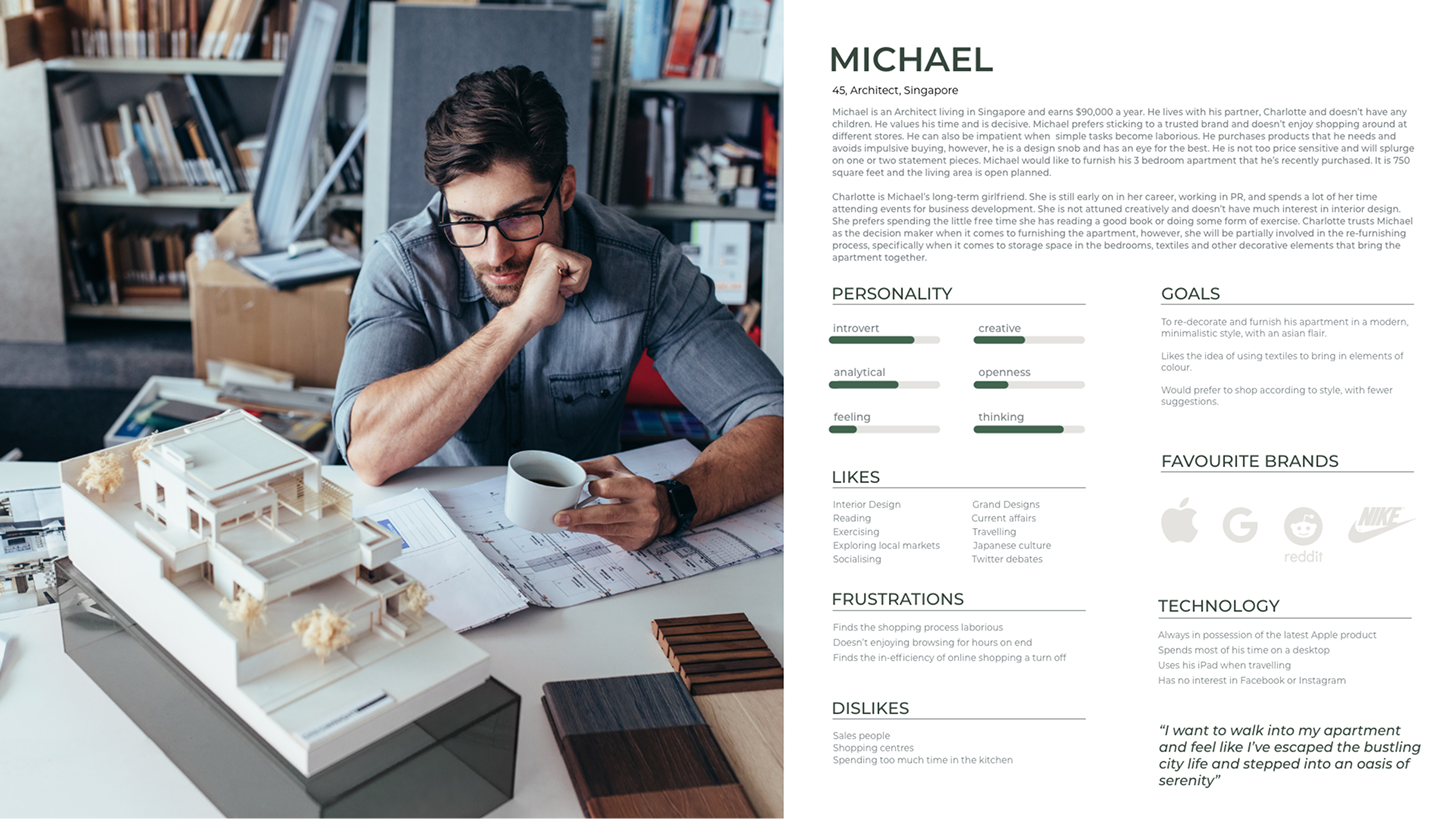
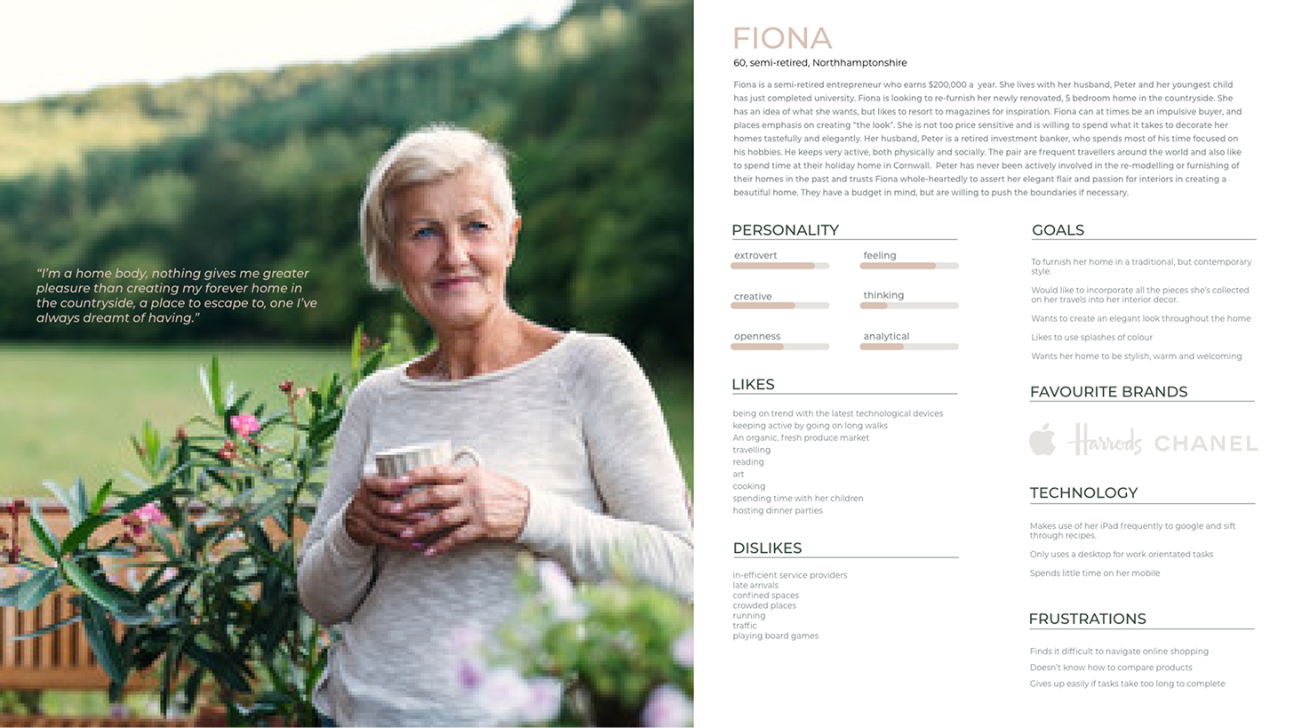
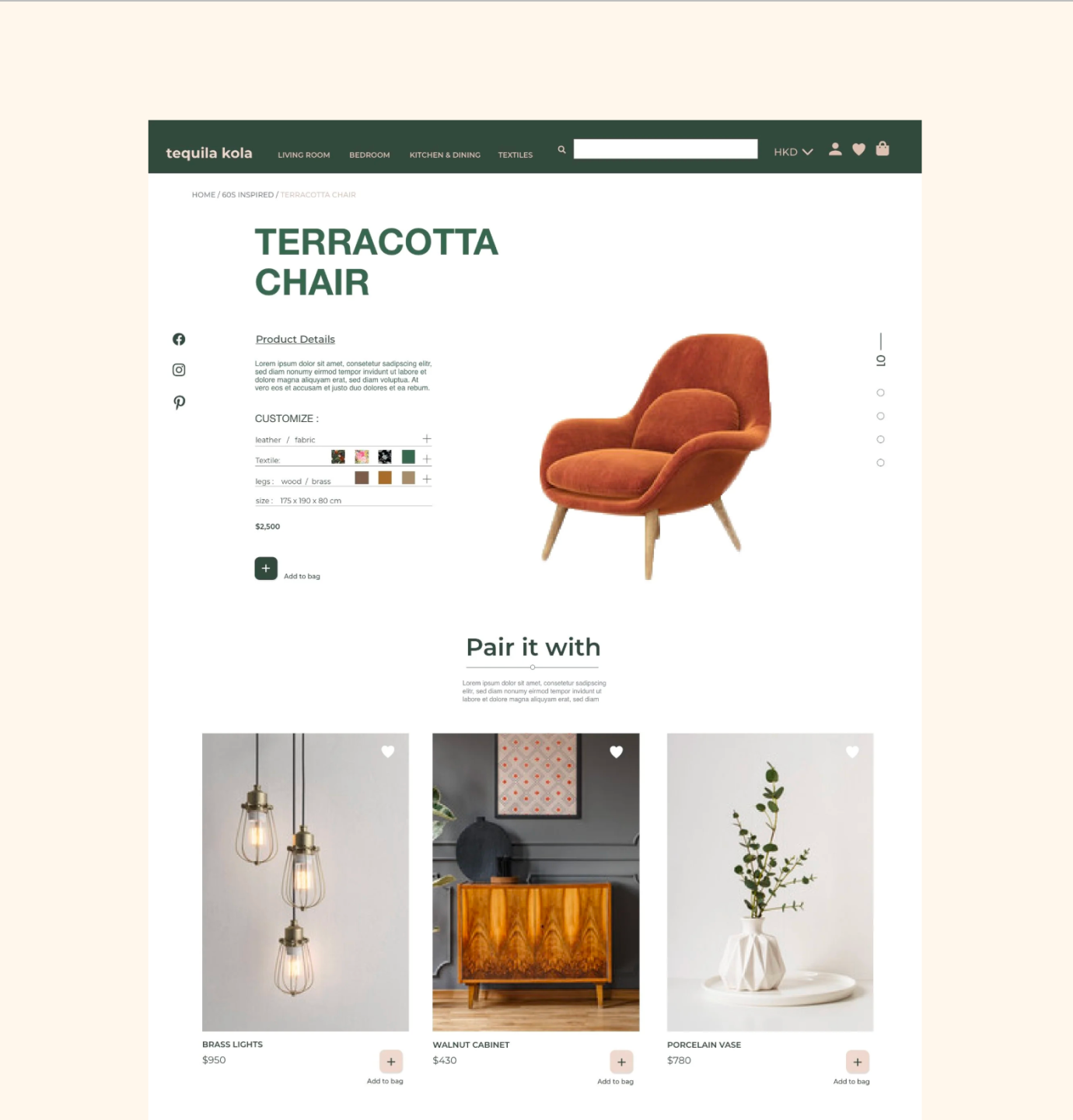
Tequila Kola sells high-end furniture, fabric, and accessories for the home. The business is built around a physical showroom, but its website had fallen behind — outdated, and out of step with a brand that positions itself as sophisticated. The brief was to design part of a new e-commerce experience that highlights product search and product detail pages, with particular emphasis on the company's upholstery service.
The core problem was competitive. Tequila Kola shares a building with several rivals, and it was losing market share to competitors with a stronger online presence. The showroom drives the same behaviour every time: customers come in to see the furniture in person, then go home and browse online before buying. If the online experience is where the decision happens, an outdated site is where the sale is lost.
Design an intuitive interface with clear, effortless navigation built around customer needs.
Give easy access to the full range — furniture, upholstery, and accessories.
Create an onboarding experience that entices customers to sign up for newsletters and offers.
Make it easy for visitors to gather the information they need about a product before buying.
Brainstorming
Generated multiple ideas and feature concepts to address user pain points and goals. Encouraged creative thinking, collaboration, and rapid exploration of solutions.
.png)
.png)
.png)
Wireframes
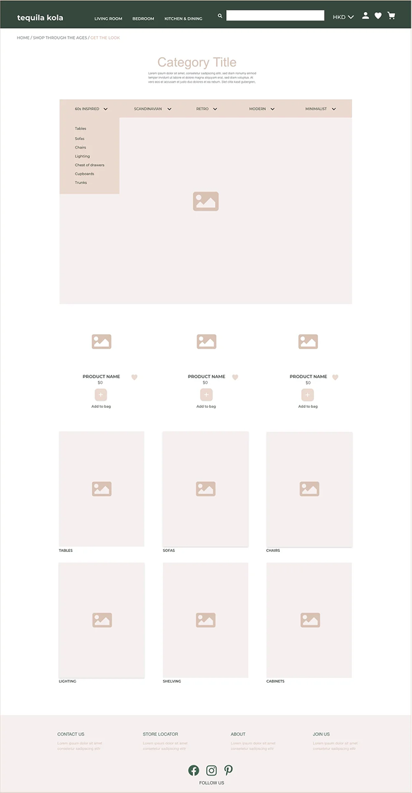
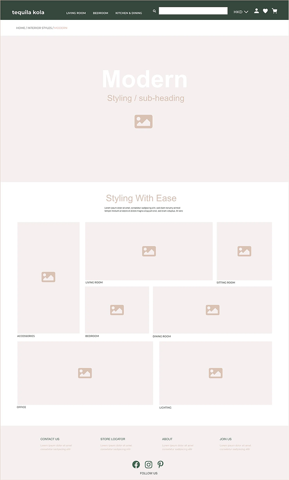
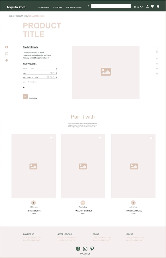
Deliverables
Traced end to end through Rachel — arriving, answering a light questionnaire, browsing a homepage tailored to her price sensitivity, and customising a piece through the virtual styling screen — the design holds to its central promise: a guided, sophisticated experience that saves a time-poor customer both time and money. Every major decision traces back to a research insight or a stated goal, which is the bar I set for the concept rather than a claim of measured performance.
Designed to move the business toward its goals. Because this is a concept project, the following are the outcomes the design is built tosupport — not results it has been shown to produce:
- Recover market share from better-resourced competitors by turning an outdated site into a point of differentiation.
- Convert showroom browsers into online buyers by making the post-visit online step clear and guided rather than frustrating.
- Grow a marketing audience through onboarding and well-timed account prompts, with the customer profile powering future personalisation.
- Elevate the upholstery service from a buried feature to a visible, customisable offering.
The honest test of whether the design meets these goals is validation with real users, outlined below.
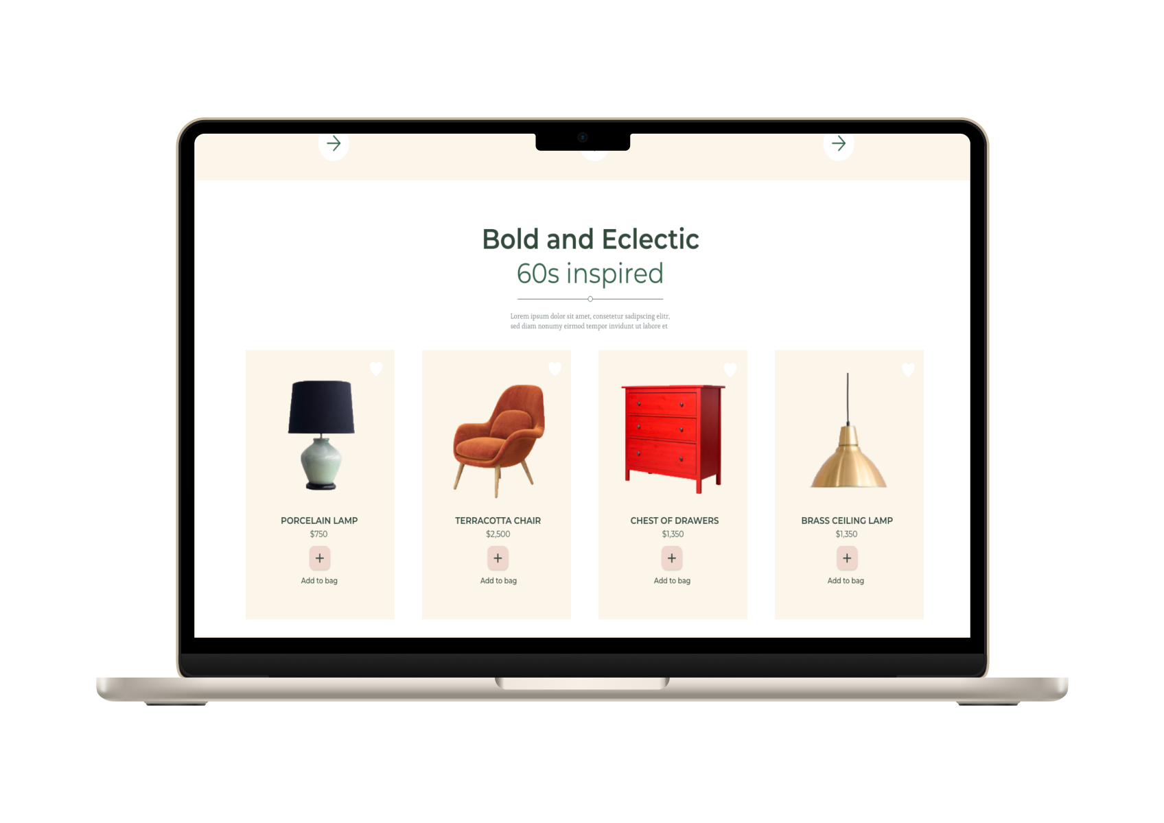
“The project delivered a cohesive, hi-fidelity concept for a desktop e-commerce experience, realised as an interactive prototype that demonstrates how the pages and elements move together. Where the competition offered cluttered catalogues, this design offers direction: a store organised around how customers actually decide — by style, by room, and by a profile the site builds from the first visit.”
Outcomes
The clearest gap in a concept project is the absence of real users, and I'd close it before making any performance claims. My plan would be moderated usability testing on the two highest-risk areas — the onboarding questionnaire and the virtual styling interaction — where my assumptions most need evidence.
Specifically: testing whether the questionnaire feels worth completing rather than like a barrier to entry, and whether the hover-and-customise virtual styling interaction is discoverable and intuitive without instruction. Those findings would either confirm the design decisions above or send me back to revise them — which is the point of testing, and the honest way to turn this concept into a validated product.
Method
Guidance is a feature, not a nicety. The strongest differentiator wasn't visual polish — it was resolving the tension between a rich catalogue and a decisive shopper. Organising the entire experience around shopping-by-style turned "too many options" into a guided path, and that reframing shaped every screen.
Findings
Choosing desktop-first ran against the mobile-first default, but it matched how people actually shop for furniture. Justifying that choice against the persona's real behaviour was a useful reminder that "best practice" is contextual.
Iteration
Moving account capture to the point of checkout intent — rather than blocking entry with it — was a small change with outsized impact on how respectful the experience feels.
Designing
Holding the guest and member perspectives in parallel kept the experience coherent, but it also revealed how easily a feature-rich app can sprawl — a reminder to keep prioritising the core journey.
.png)
.png)
By focusing on user needs and simplifying complex flows, the app turns home exchange into a seamless, confident experience.
That Brings Ideas to Life
Print media Moby Dick
Infographics I love my city
Juiced
Project one
Ecommerce website
Juvage
UX/UI Mobile Design
.png)

.png)