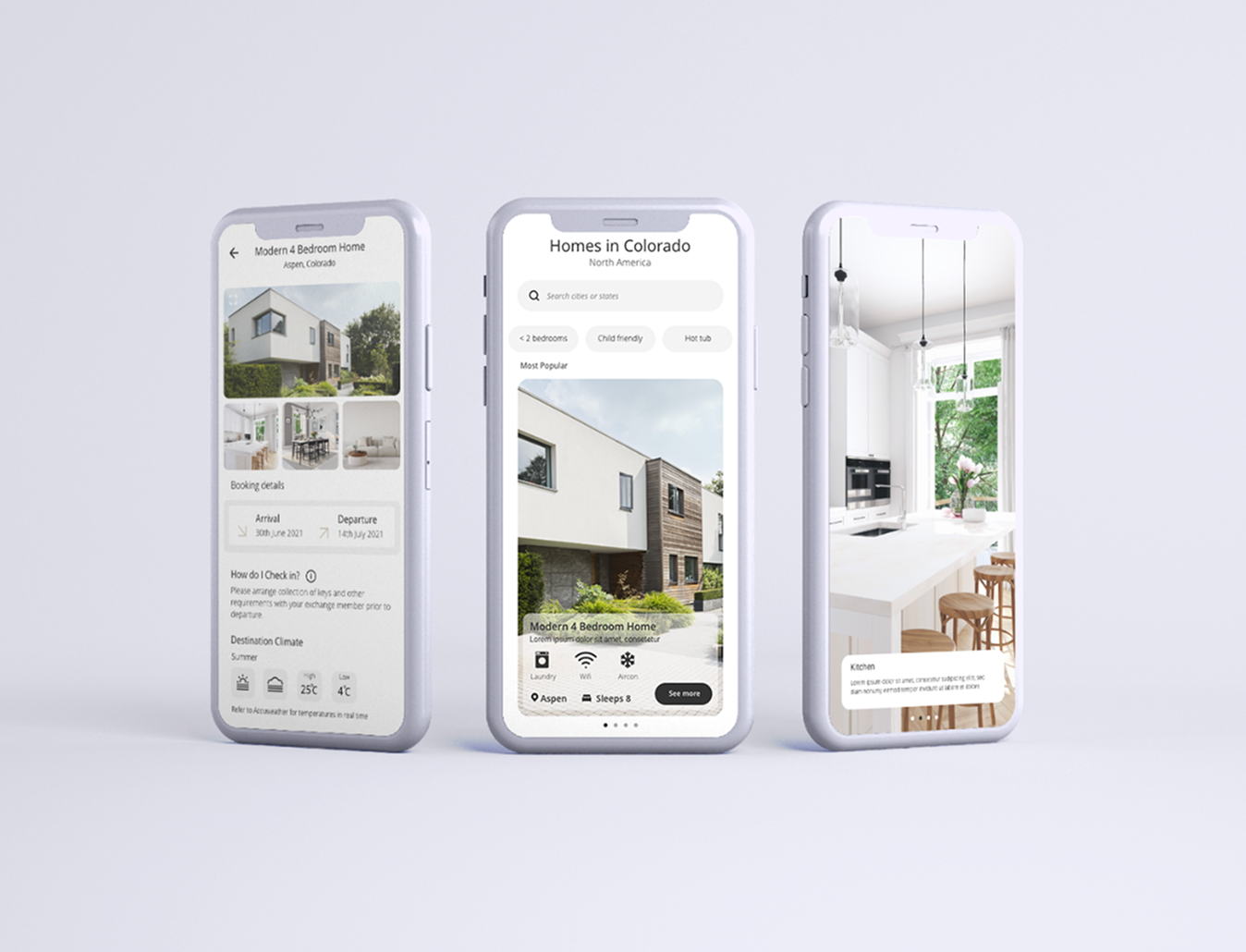
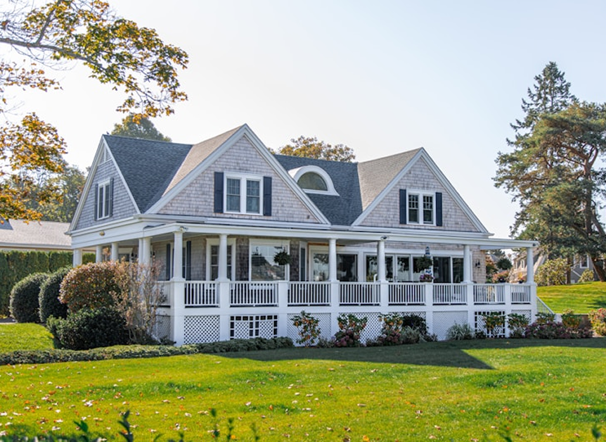
Home exchange app that makes finding and managing stays simple and intuitive.
Design Thinking Process guides this project through Empathize, Define, Ideate, Prototype, and Test & Iterate to create user-centered solutions.
Goal
The goal was to understand how users approach home exchanges, what concerns them, and where current platforms create friction. This helped identify trust, clarity, and ease of use as key factors.
Methods
Research included user interviews, journey mapping, and competitive analysis of existing home exchange platforms. This provided insight into both emotional and functional user needs.
Insights
Users wanted a simpler way to browse listings, manage exchanges, and communicate with hosts. Trust, transparency, and clear status tracking were critical to feeling confident throughout the process.
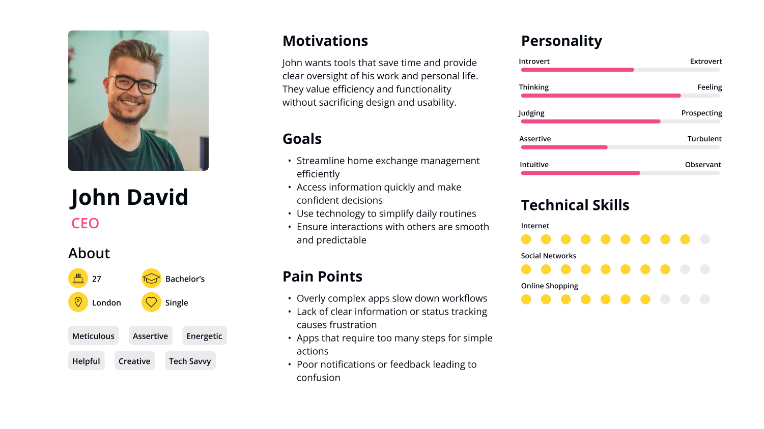
User personas
.png)
.png)
.png)
Users struggle to find and manage home exchanges because existing platforms are often complex, unclear, and difficult to trust. Key pain points include confusing navigation, lack of transparency, and inefficient communication with hosts.
Simplify discovery and booking of home exchanges with a clear, intuitive interface.
Build trust and transparency throughout the user journey.
Make communication and exchange management seamless and efficient.
Ensure the app adapts to different user types and travel preferences.
Brainstorming
During brainstorming sessions, multiple ideas and feature concepts were explored to address user pain points and goals. This phase encouraged creative thinking, collaboration, and the rapid generation of potential solutions.
Sketches
Early sketches visualized key flows and interactions, helping to quickly test layout ideas and screen hierarchy. These low-fidelity representations allowed for rapid iteration before moving to wireframes and high-fidelity designs.

Wireframes

.svg)
.svg)
Deliverables
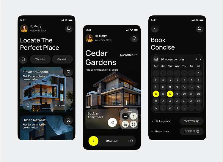
High-fidelity screens were created to cover all key user flows, including search, booking, and managing stays. Interactive prototypes allowed for early testing of navigation and functionality, while a component library ensured consistency across the app.
.svg)
“The interface is clean, intuitive, and designed to feel effortless for users. Micro-interactions and feedback mechanisms were added to enhance trust, engagement, and overall confidence in the platform.”
.png)
.png)
By focusing on user needs and simplifying complex flows, the app turns home exchange into a seamless, confident experience.
That Brings Ideas to Life
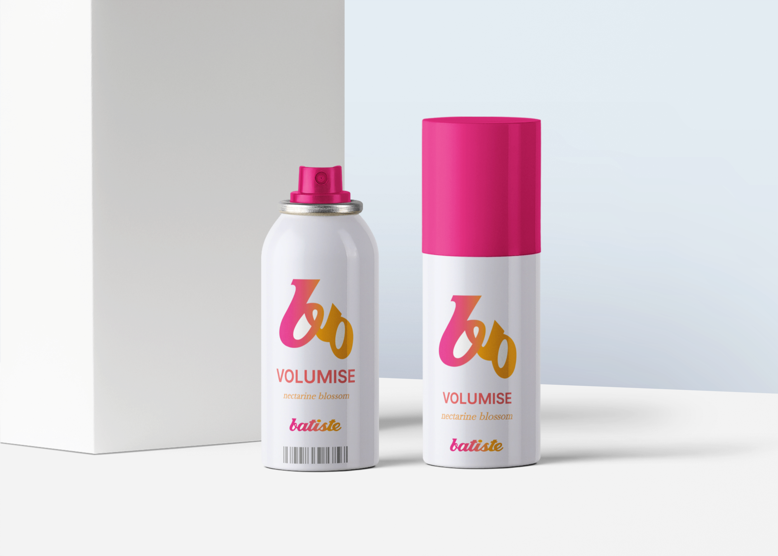
Batiste package logo design
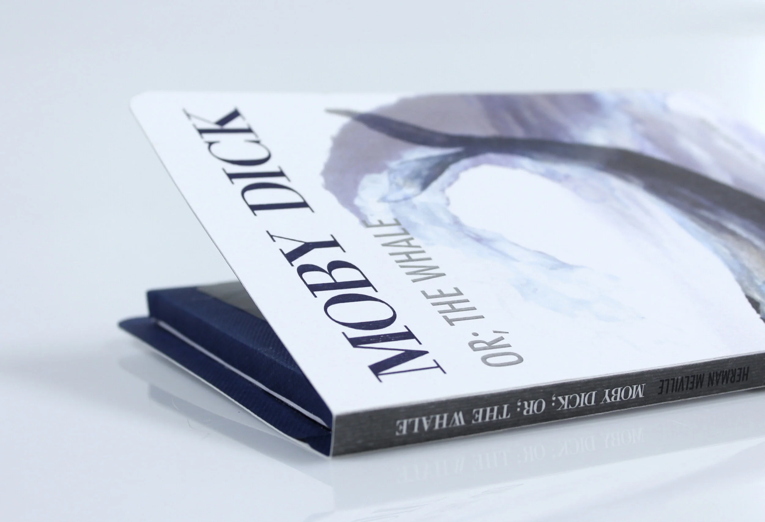
Print media Moby Dick
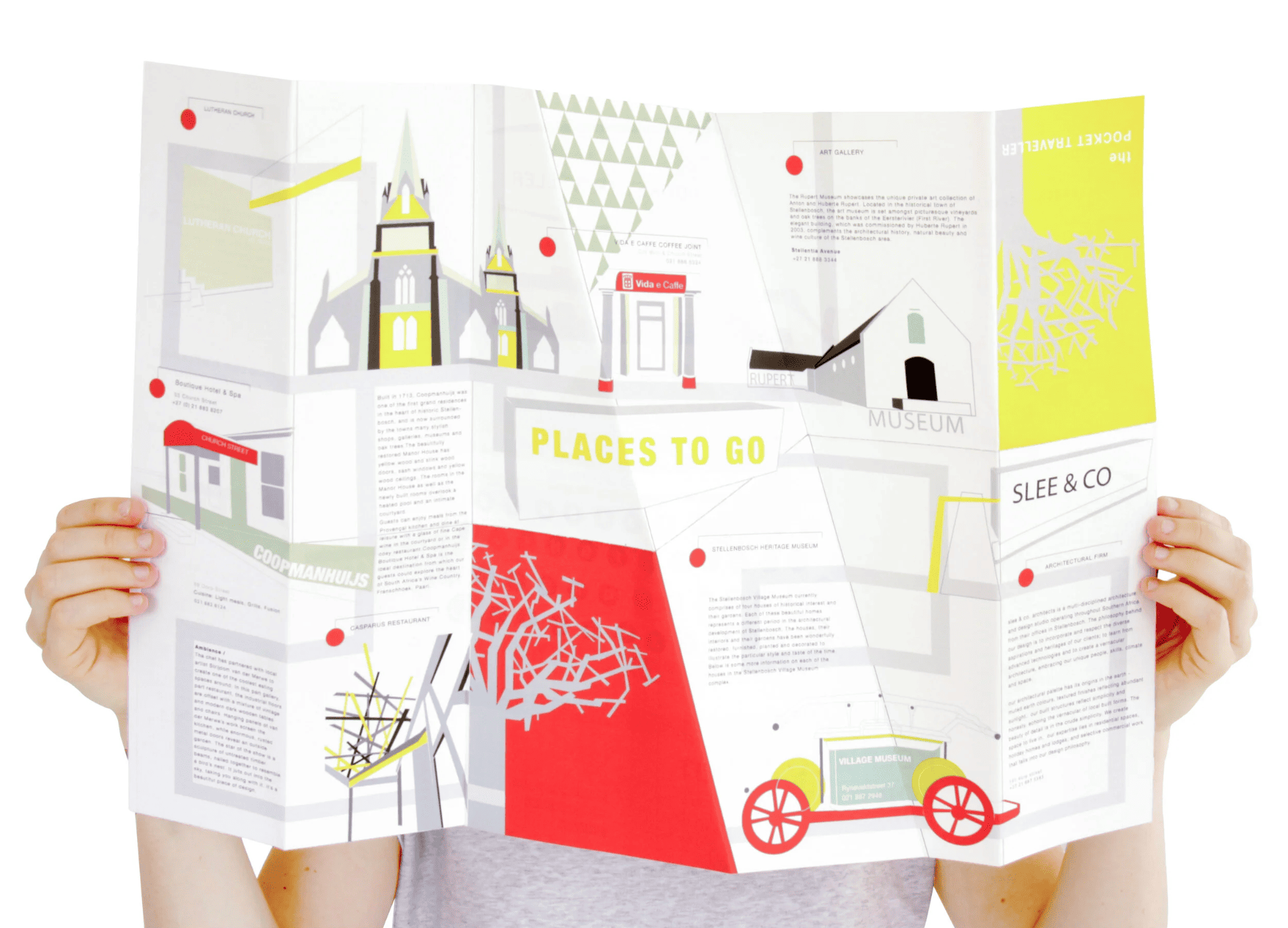
Infographics I love my city
Juiced
Project one
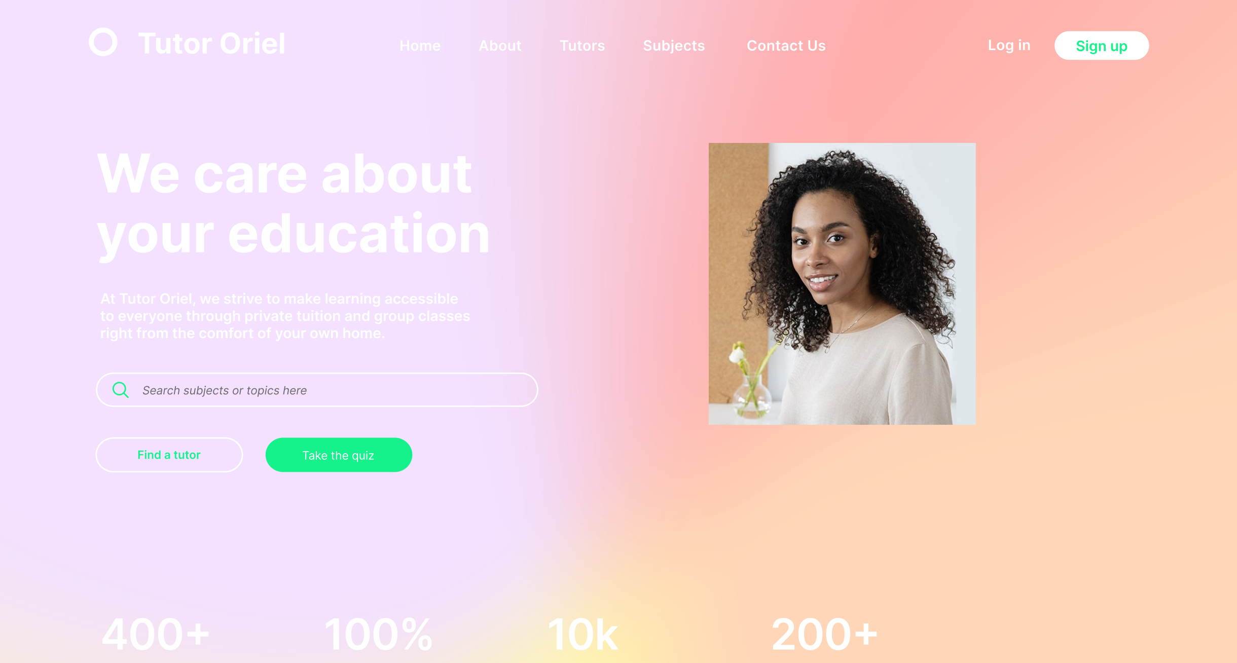
Ecommerce website
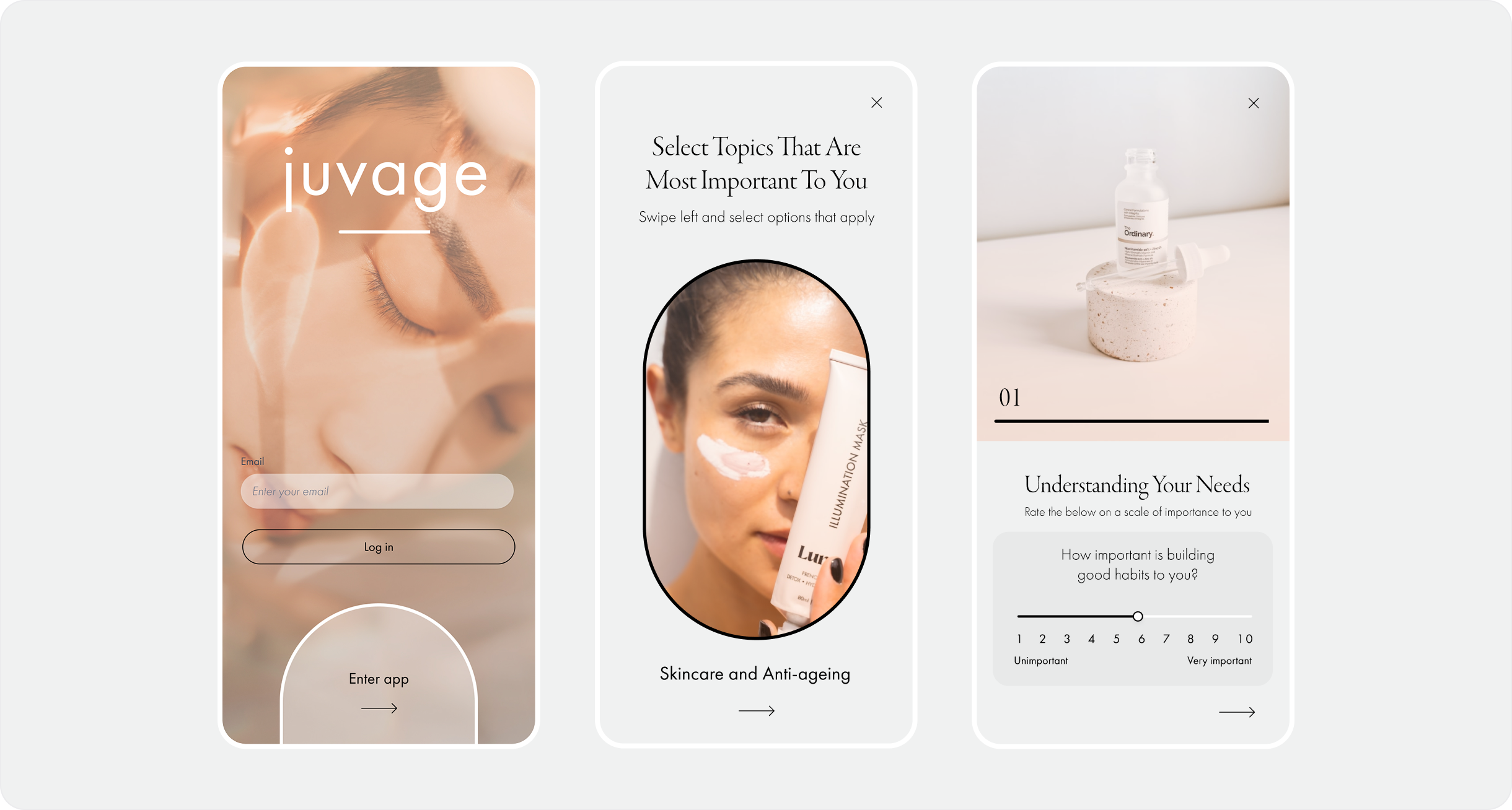
Juvage
UX/UI Mobile Design