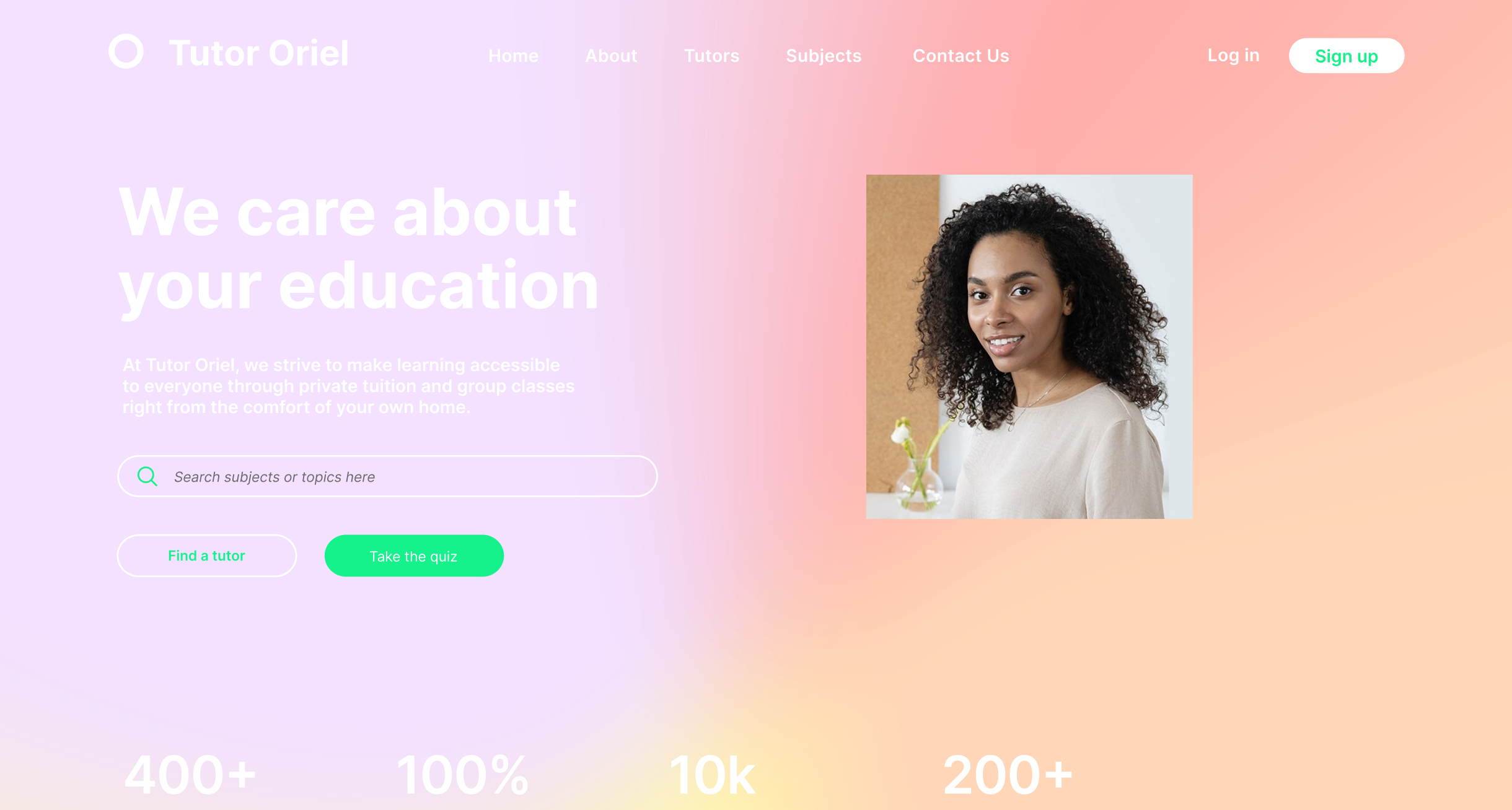
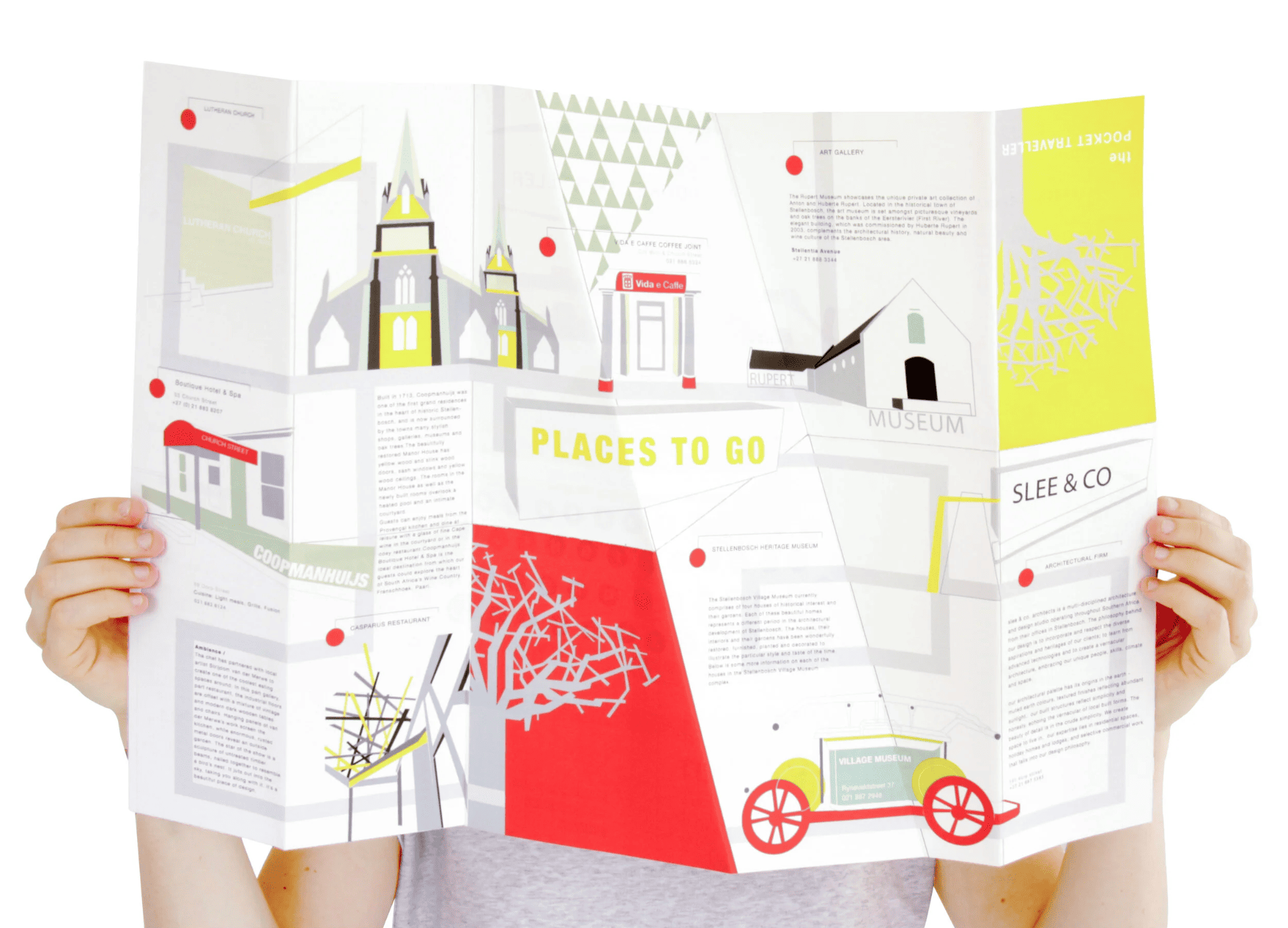
A compact travel guide for exploring Stellenbosch’s architecture and culture.
Design Thinking Process guides this project through Empathize, Define, Ideate, Prototype, and Test & Iterate to create user-centered solutions.
Goal
Create a compact travel guide that helps users explore Stellenbosch on foot, highlighting its architecture, galleries, museums, and local eateries in an intuitive and engaging way.
Methods
Research included on-site exploration, mapping of walking routes, and analysis of architectural and cultural landmarks. This provided both functional and experiential insights into how visitors navigate and engage with the town.
Insights
Users want clear directions, concise information, and a visually appealing format that fits in a pocket. Personalized highlights and intuitive wayfinding are key to making the sightseeing experience effortless and enjoyable.
Visitors to Stellenbosch want to explore the town’s architecture, galleries, and eateries on foot, but find it difficult to plan an efficient route and identify key points of interest. They need a compact, intuitive guide that highlights must-see locations and makes navigation easy.
Simplify route planning and exploration with a clear, intuitive layout.
Make discovering landmarks, galleries, and cafes seamless and easy to follow.
Provide personalized highlights and suggestions based on interests.
Ensure the guide is compact, portable, and easy to use on the go.
Deliverables
High-fidelity screens were created to cover all key flows, including route planning, points of interest, and personalized recommendations. Interactive prototypes allowed early testing of navigation and usability, while a component library ensured visual consistency across the guide.
.png)
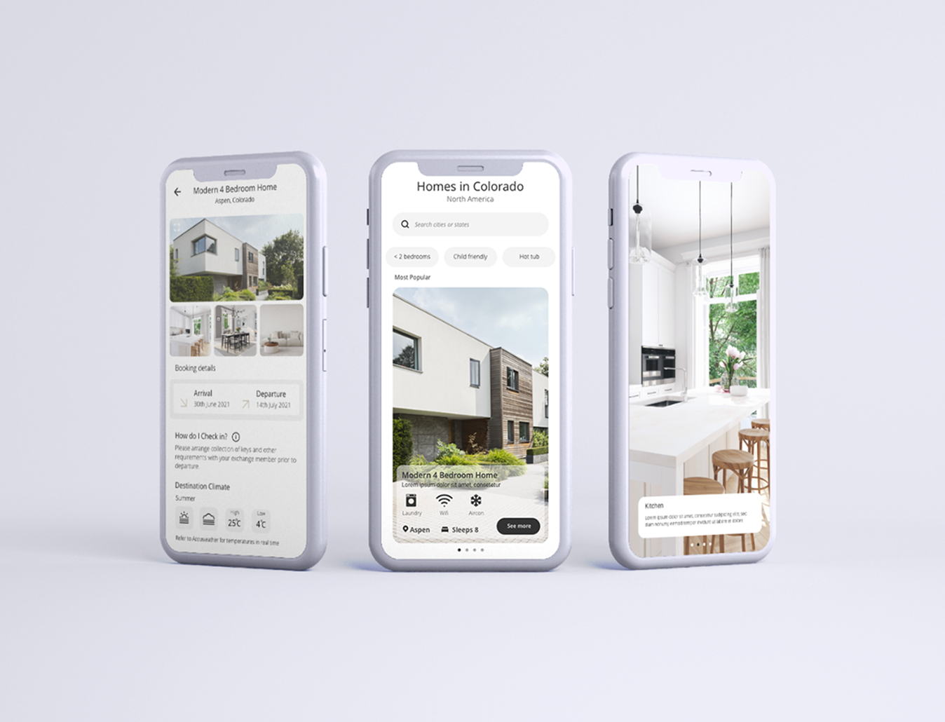
“The interface is clean, intuitive, and designed to make exploring Stellenbosch effortless. Visual cues and markers were added to enhance trust, engagement, and user confidence.”
.png)
.png)
.png)
By focusing on user needs and simplifying complex flows, the app turns home exchange into a seamless, confident experience.
That Brings Ideas to Life
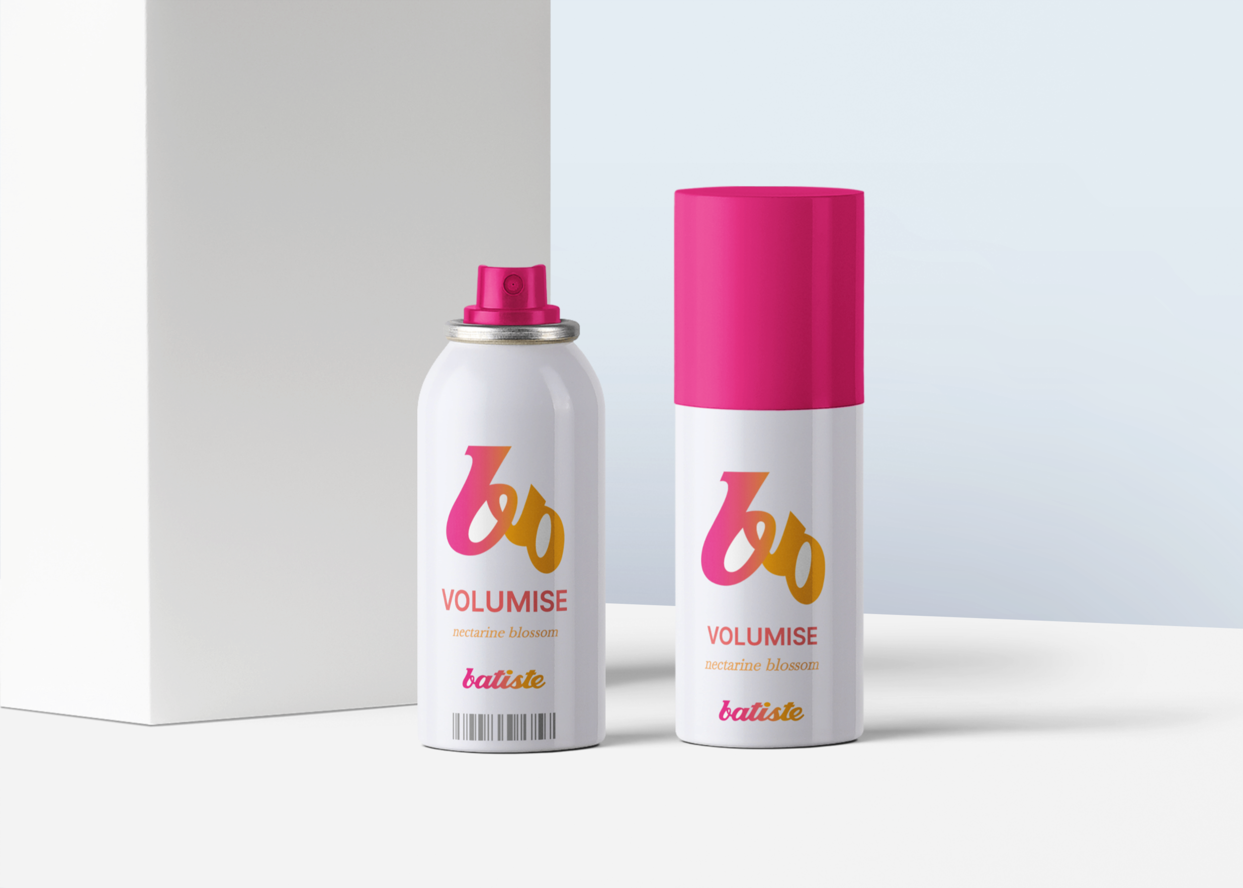
Batiste package logo design
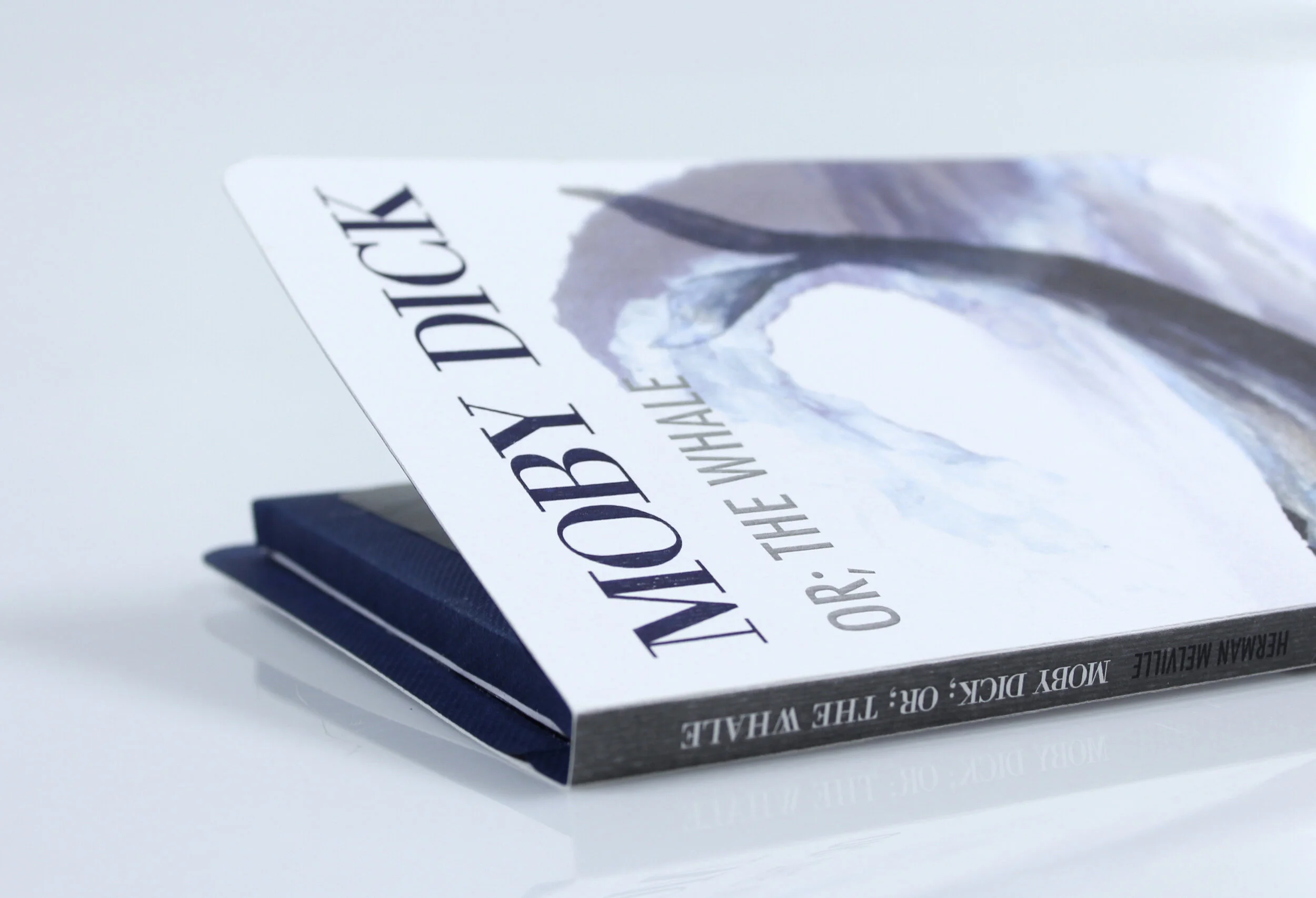
Print media Moby Dick
Infographics I love my city
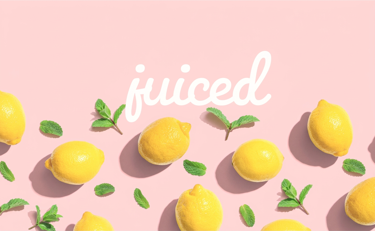
Juiced
Project one
Ecommerce website
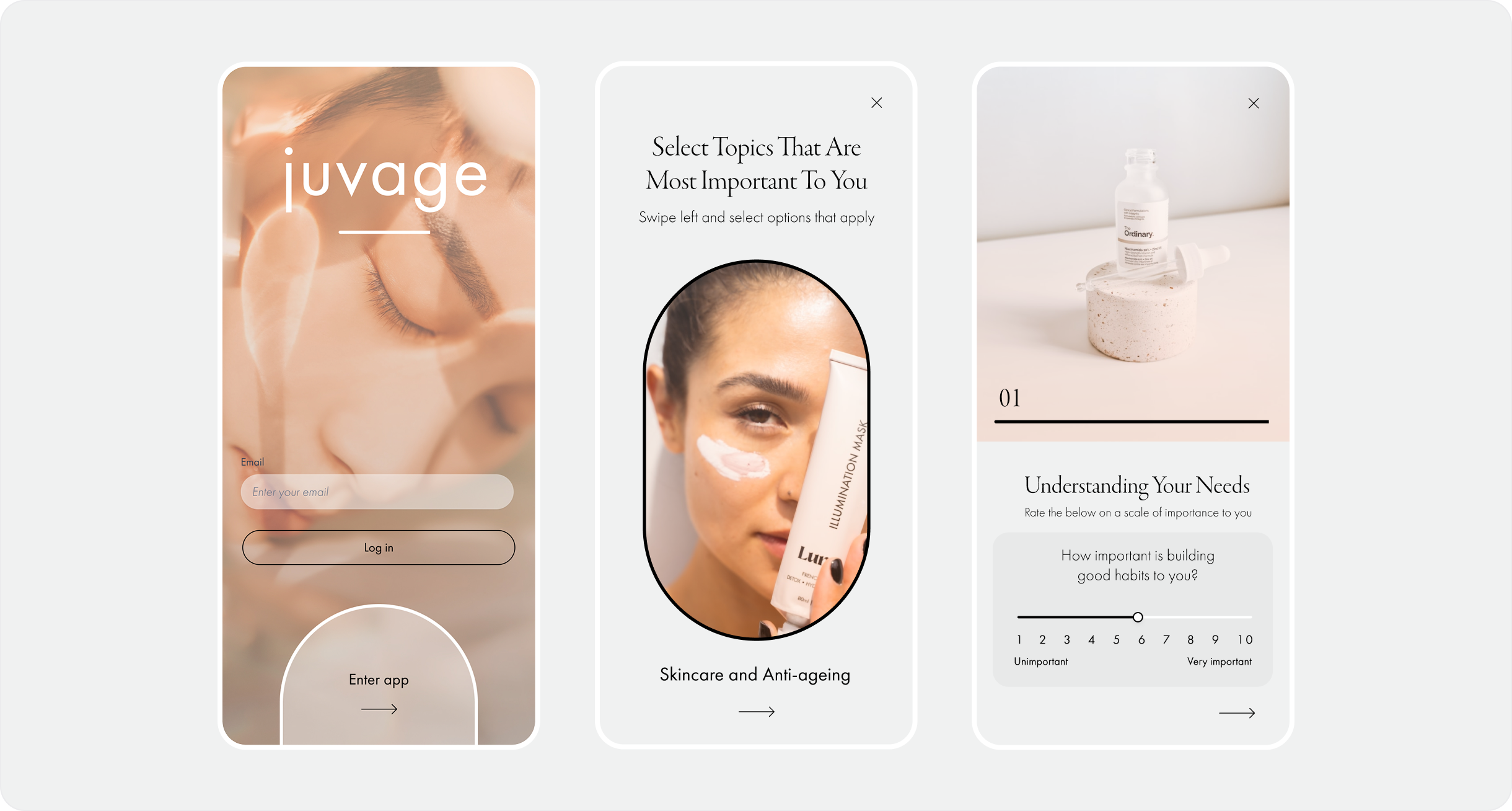
Juvage
UX/UI Mobile Design