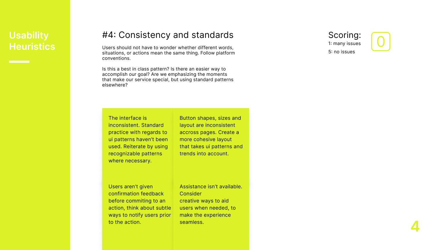
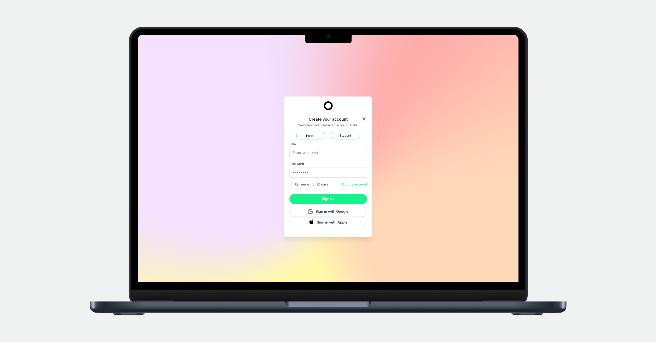
Heuristic evaluation of Tutor Oriel’s sign-up flow to identify usability issues.
Design Thinking Process guides this project through Empathize, Define, Ideate, Prototype, and Test & Iterate to create user-centered solutions.
Goal
Evaluate Tutor Oriel’s sign-up flow to uncover usability issues, reduce friction, and improve the overall user experience, ensuring the system communicates clearly and supports users at every step.
Methods
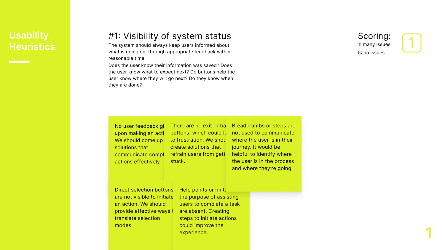
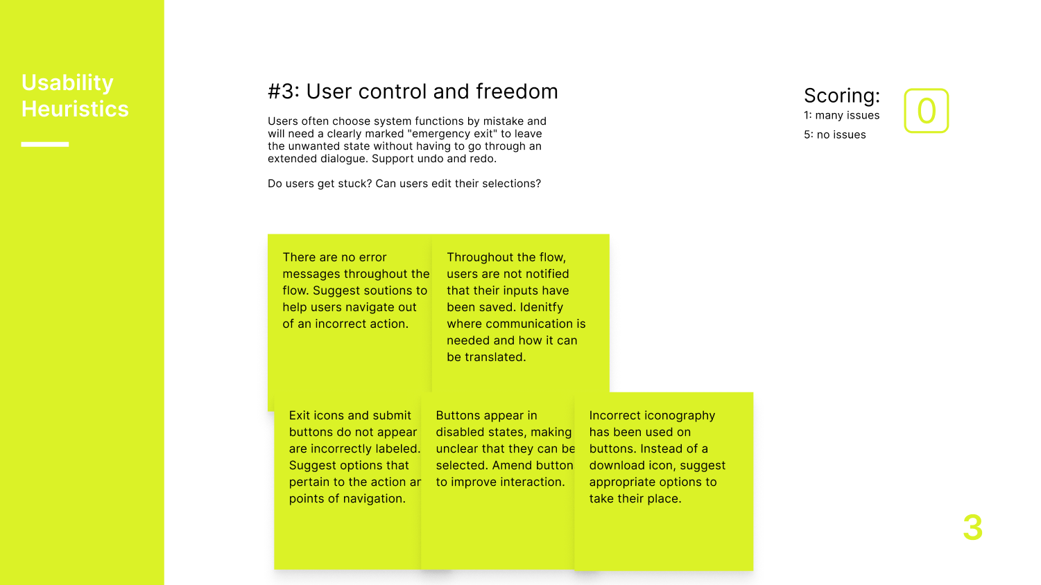
Heuristic analysis based on established usability principles, combined with notes, scoring, and audits of adjacent and analogous industries to identify best practices and inspiration for interface improvements.
Insights
Key issues included unclear system feedback, inconsistent terminology, and cognitive overload. Simplifying the flow, clarifying instructions, and aligning the interface with real-world expectations can significantly improve completion rates and user satisfaction.
User personas
.png)
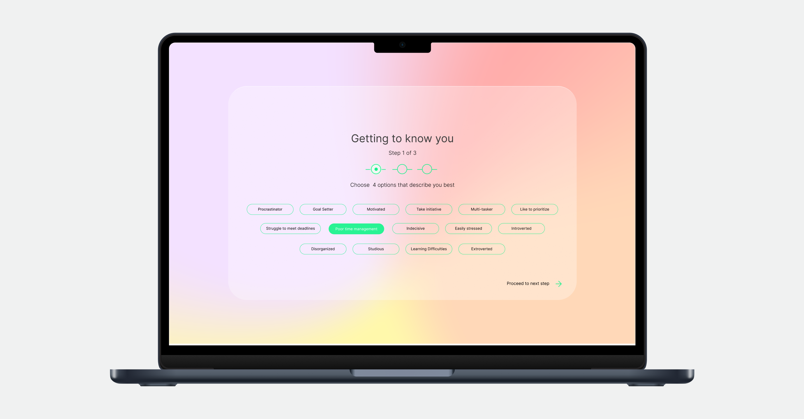
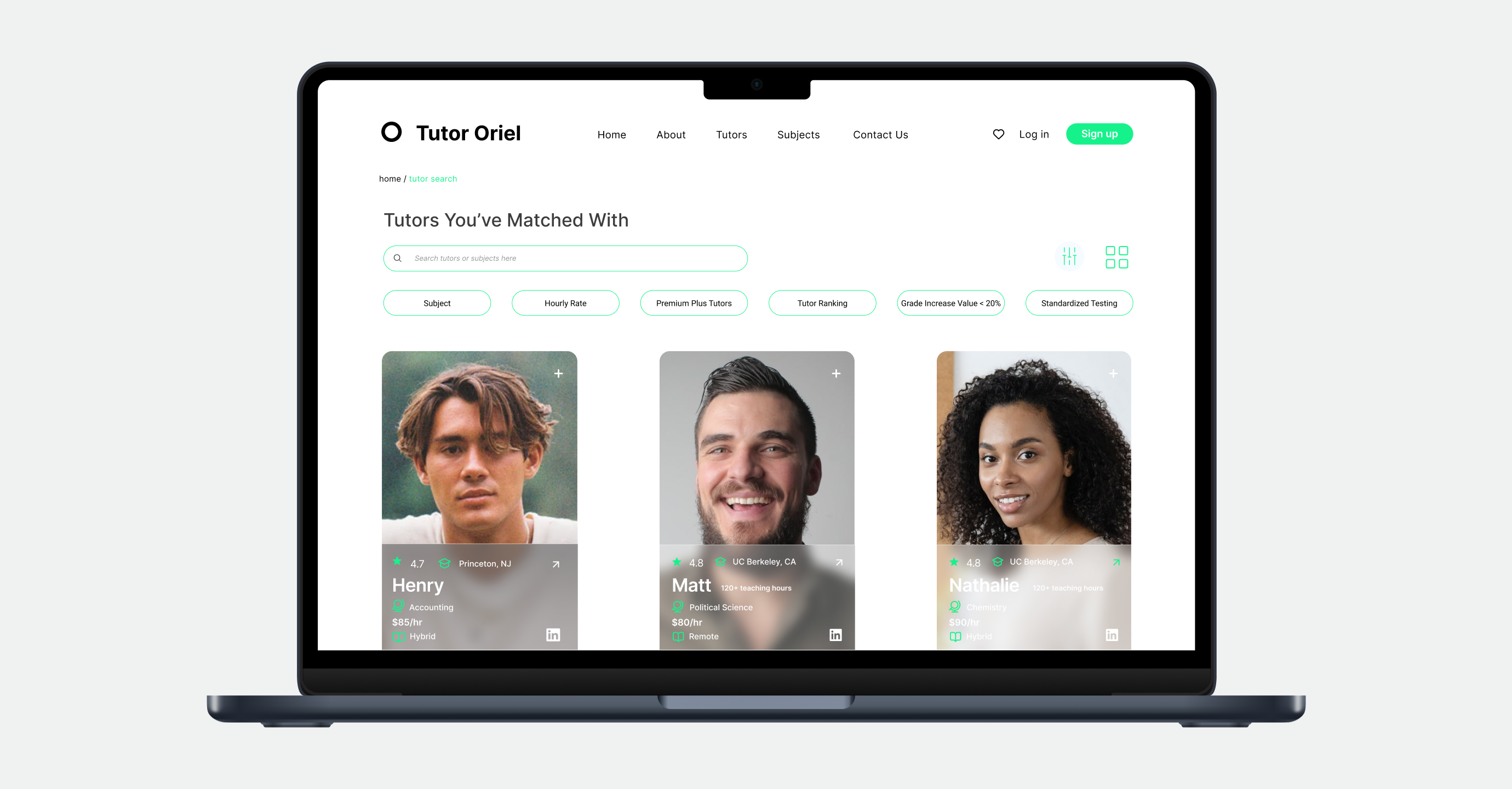
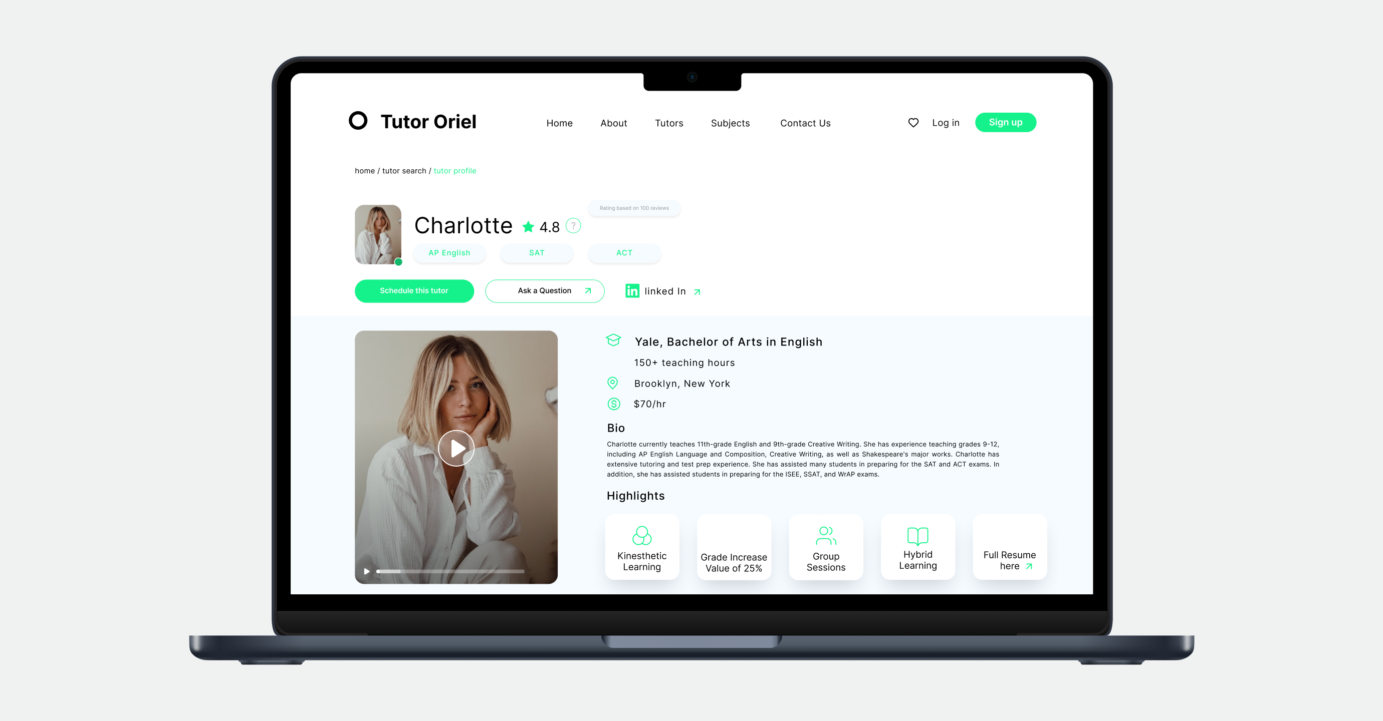
Users struggle to complete the Tutor Oriel sign-up flow because the current design is confusing, inconsistent, and overwhelming. Key pain points include unclear instructions, poor feedback on actions, and difficulty navigating through account creation and scheduling steps.
Simplify the sign-up and scheduling flow with a clear, intuitive interface.
Provide users with consistent feedback and guidance at every step.
Simplify account creation, tutor selection, and scheduling.
Ensure the flow is friendly, clear, and trustworthy.
Brainstorming
Generated multiple ideas and feature concepts to address usability issues and user pain points. Encouraged creative thinking, collaboration, and rapid solution exploration.
.png)
.png)
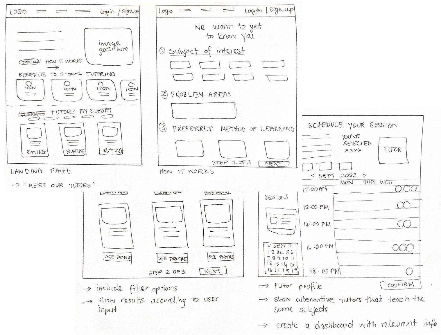
Sketches
Created early sketches to visualize key flows and interactions. These low-fidelity layouts helped quickly test structure, hierarchy, and screen order before moving to higher-fidelity designs.
Wireframes
.svg)
.svg)
.svg)
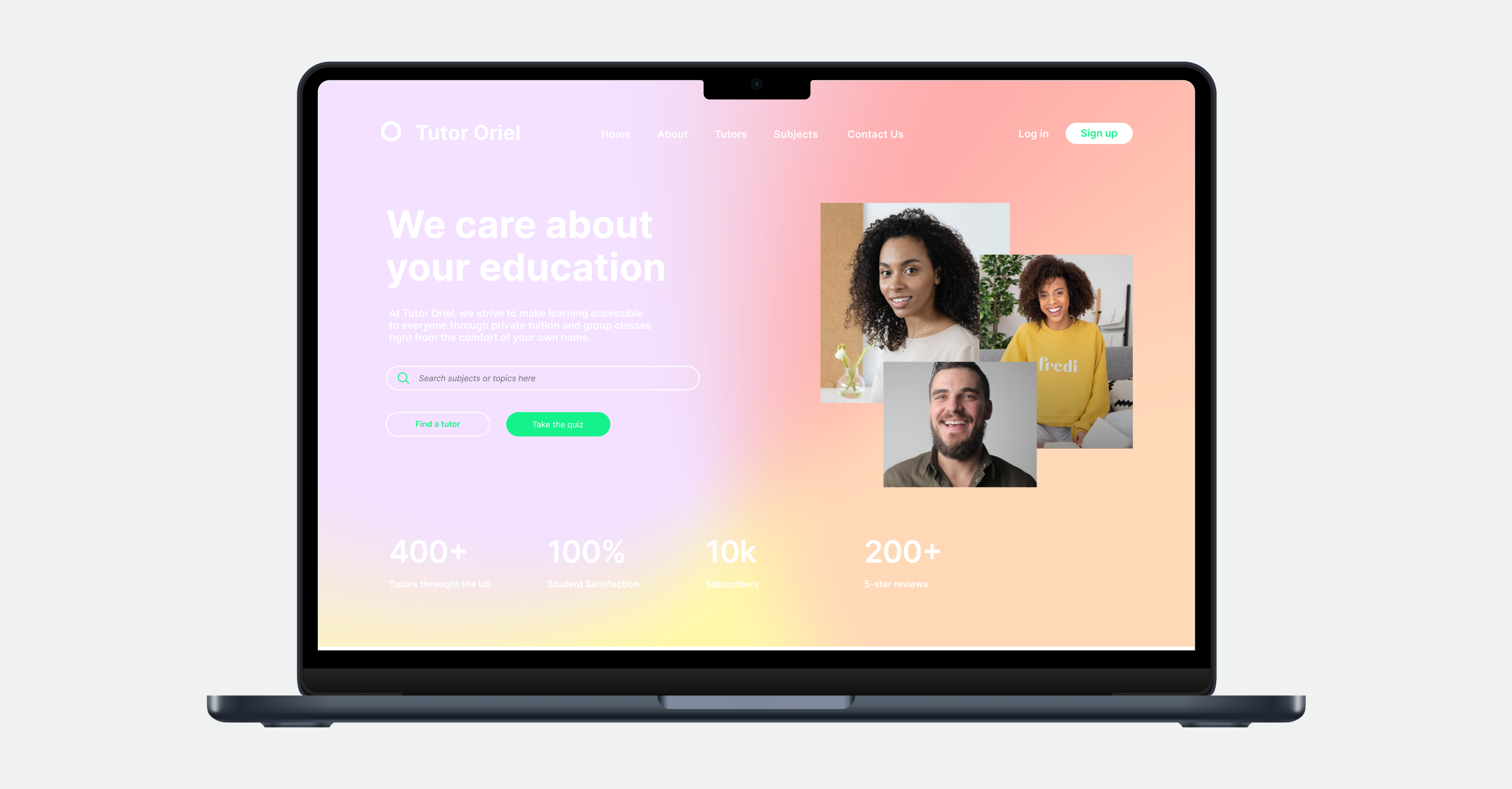
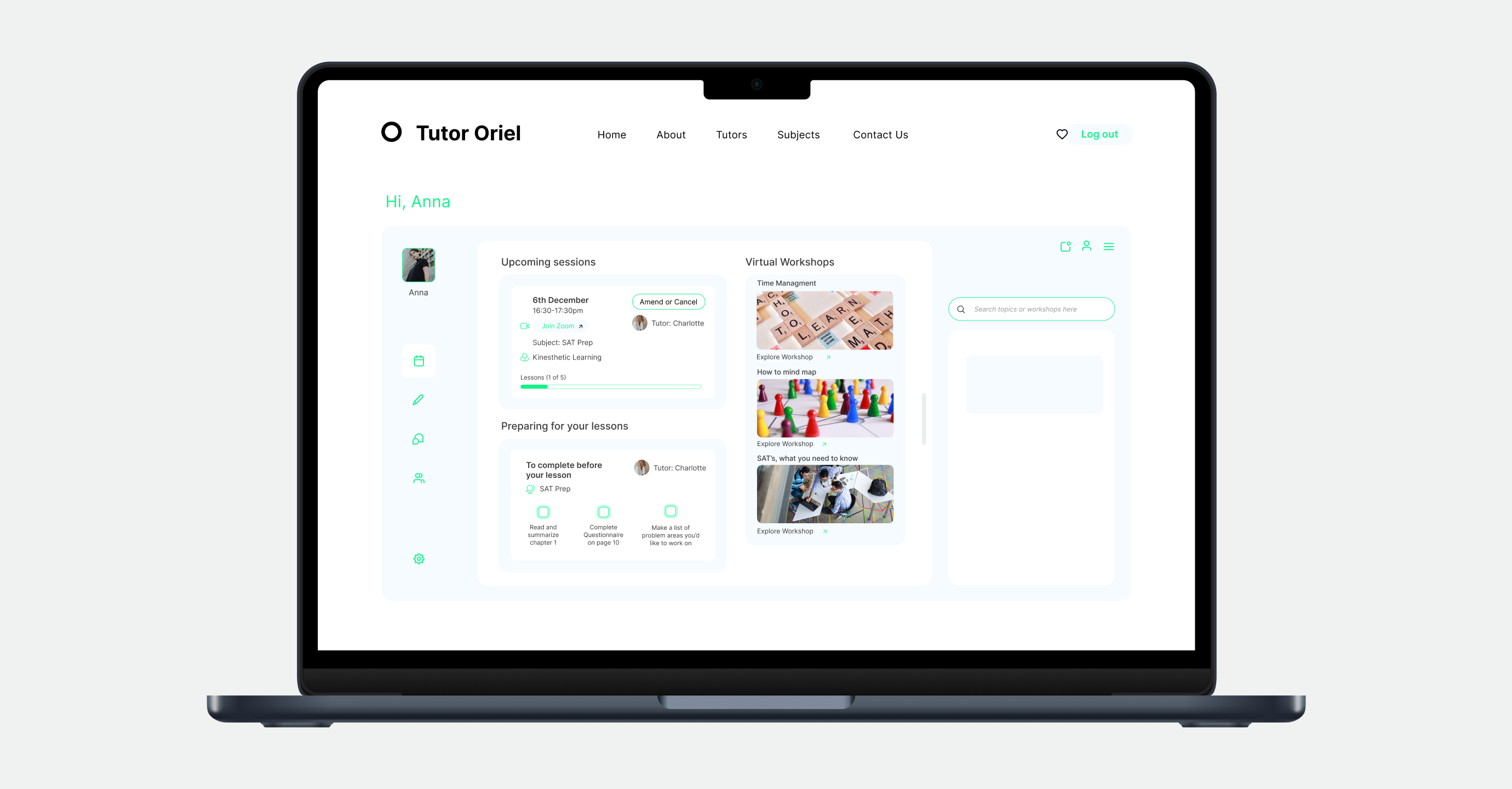
Deliverables
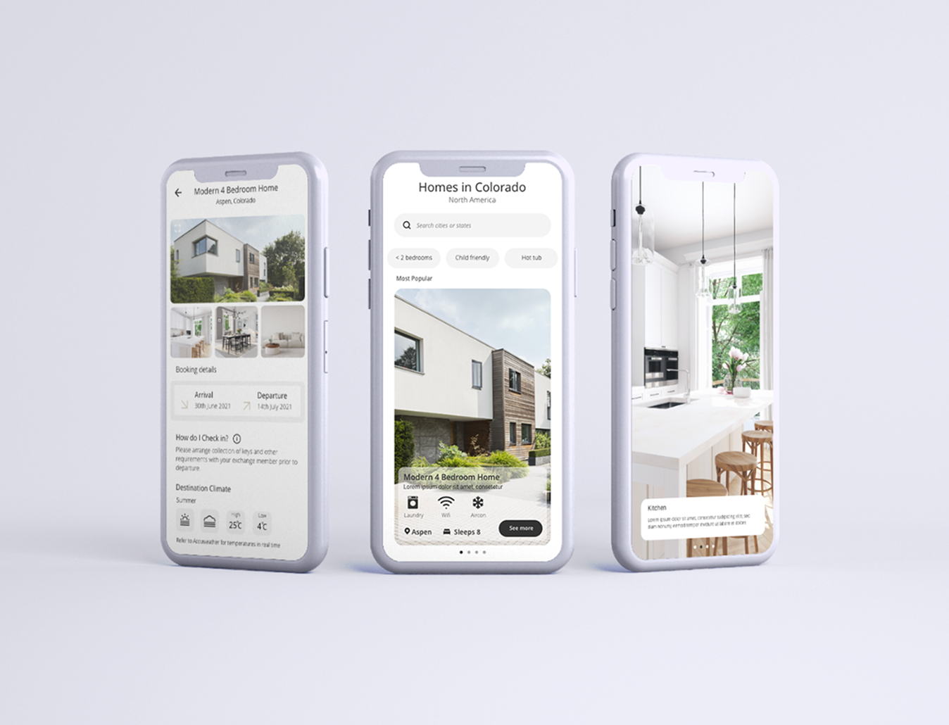
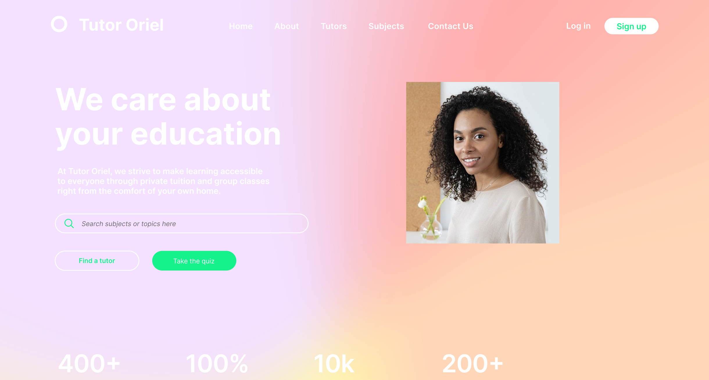
High-fidelity screens were created for the full sign-up and scheduling flow. Interactive prototypes allowed early testing of navigation, feedback, and usability, while consistent patterns ensured clarity across the interface.

“The interface is clear, guided, and designed to help users complete tasks effortlessly. Feedback and cues were added to build trust, reduce errors, and improve confidence throughout the flow.”
By focusing on user needs and simplifying complex flows, the app turns home exchange into a seamless, confident experience.
That Brings Ideas to Life
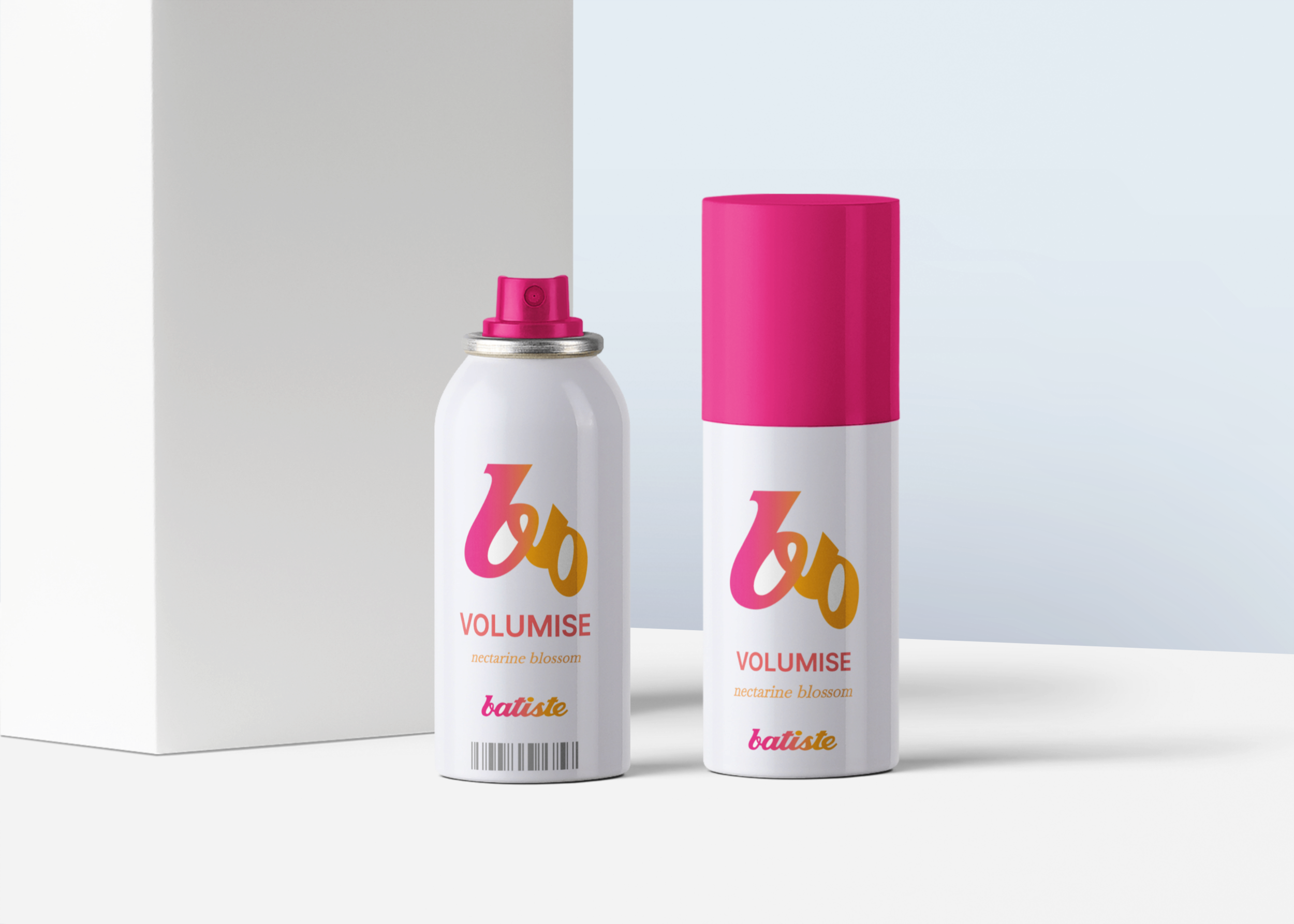
Batiste package logo design
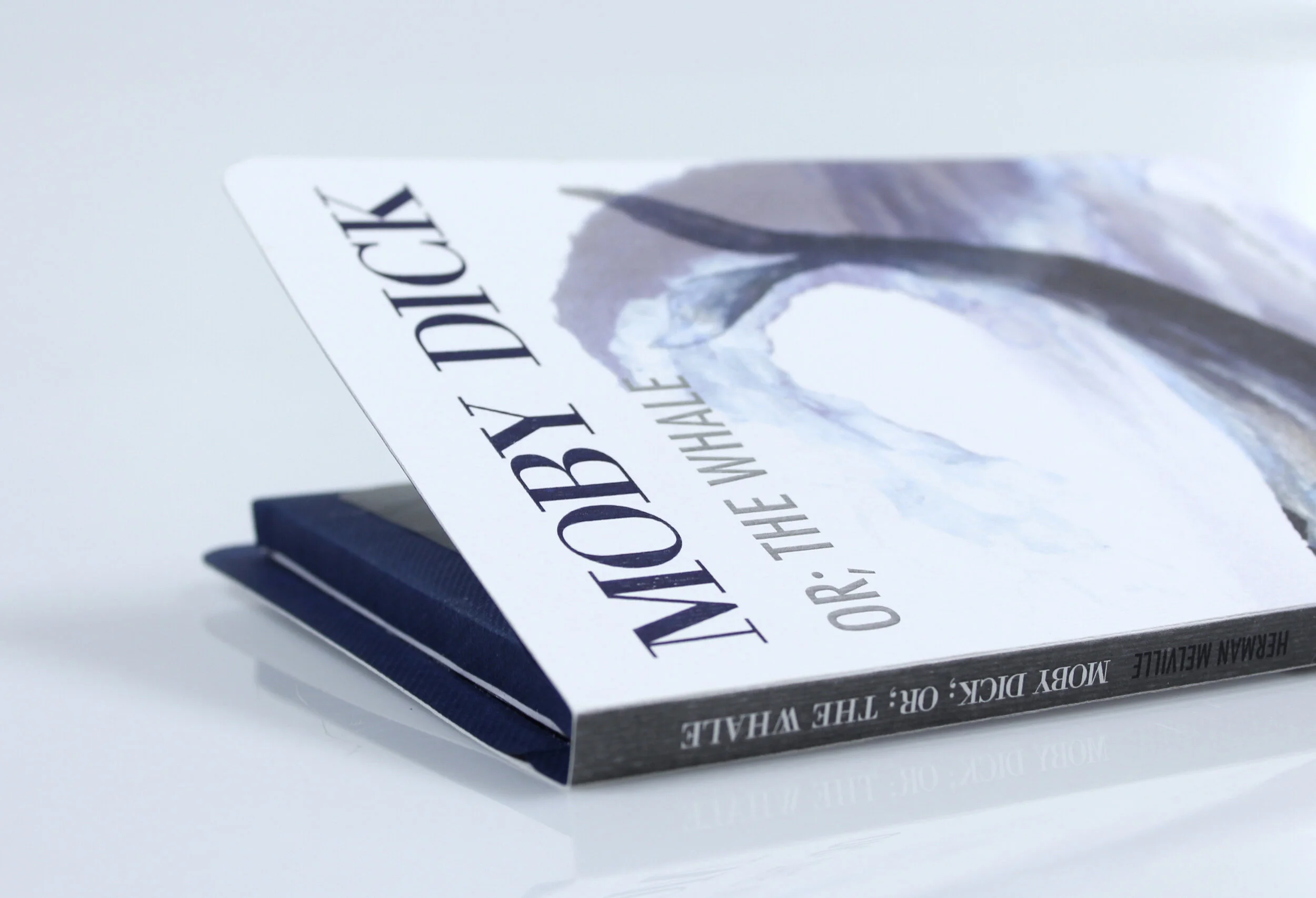
Print media Moby Dick
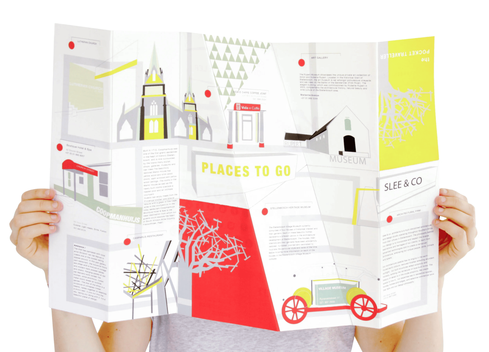
Infographics I love my city
Juiced
Project one
Ecommerce website
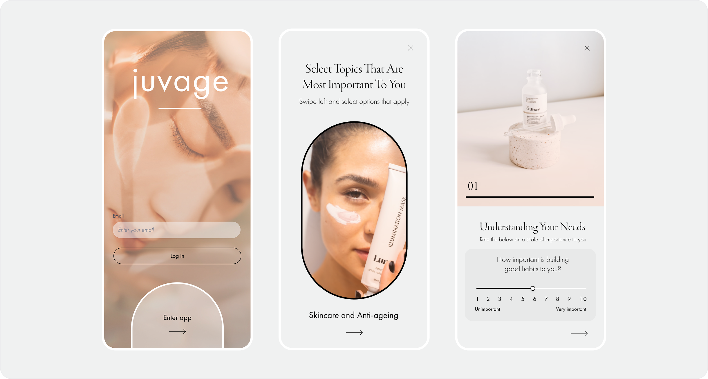
Juvage
UX/UI Mobile Design