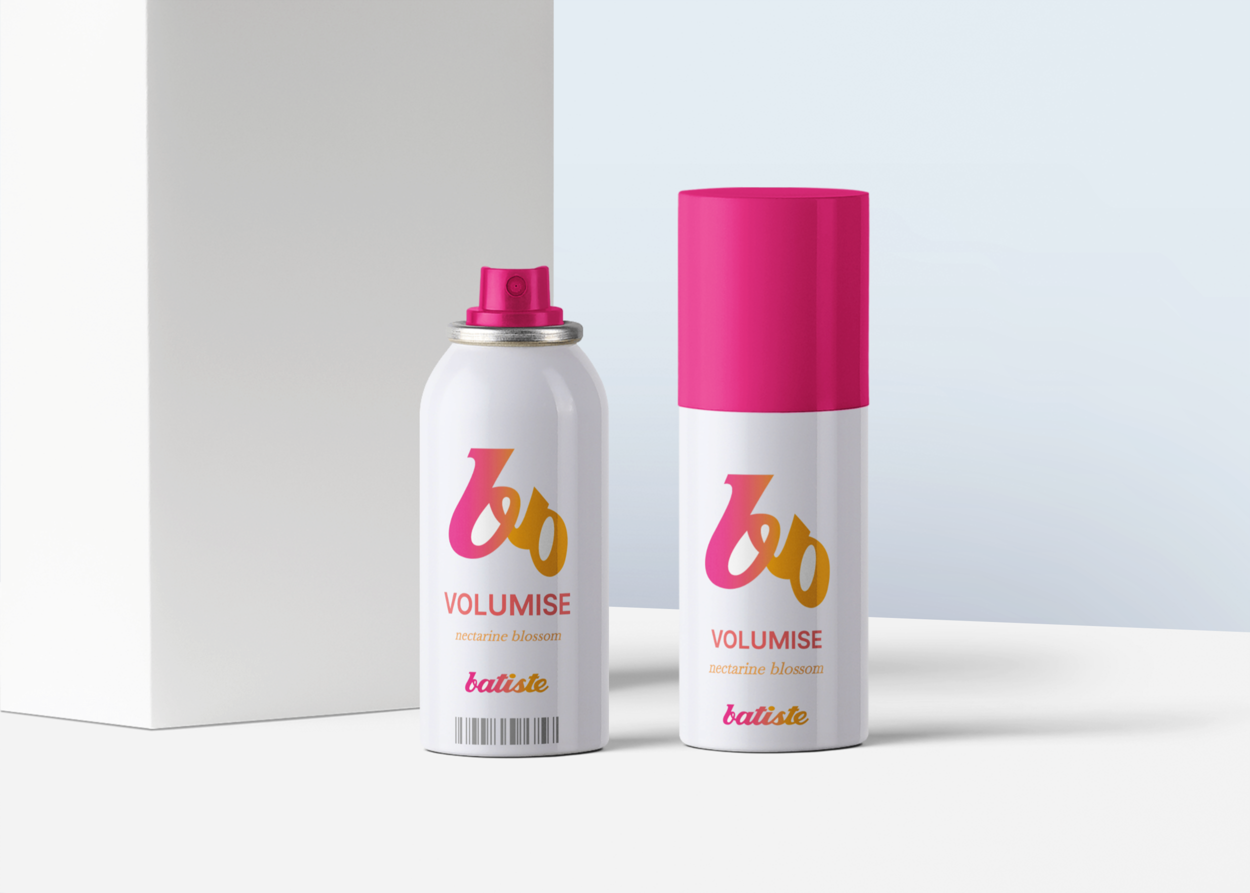
A digital design project for packaging and visual identity of Batiste Dry Shampoo.
Design Thinking Process guides this project through Empathize, Define, Ideate, Prototype, and Test & Iterate to create user-centered solutions.
Goal
Create a packaging and visual identity system for Batiste Dry Shampoo that is bold, trend-led, and appealing to both new and existing customers.
Methods
Research included analyzing competitor brands, trend forecasting in beauty packaging, and testing visual styles with target users. This provided both emotional and functional insights into what resonates with customers.
Insights
Users respond positively to clean typography, vibrant gradients, and cohesive color schemes. Clear visual hierarchy and distinctive fragrance cues help differentiate products and drive engagement.
Beauty-conscious users want a haircare product that fits effortlessly into their routine, stands out on the shelf, and clearly communicates scent and category. Current packaging feels generic and does not appeal to trend-focused or new customers, making it harder for them to choose and engage with the brand.
Create visually distinctive packaging that clearly differentiates fragrances and product categories.
Make the design trend-forward and appealing to both new and existing Batiste customers.
Ensure the identity feels cohesive across all three fragrance variants.
Enhance shelf impact and brand recognition through bold typography, color, and gradients.
Deliverables
High-fidelity mockups were created for all key packaging concepts, including logo redesign, fragrance differentiation, and gradient layouts. Interactive prototypes allowed early feedback on shelf appeal and visual hierarchy, while a design system ensured consistency across all variants.
.svg)
“The packaging is bold, clean, and trend-forward, designed to capture attention and communicate fragrance identity clearly. Color coding and typography reinforce brand recognition and engagement.”
.png)
.png)
.png)
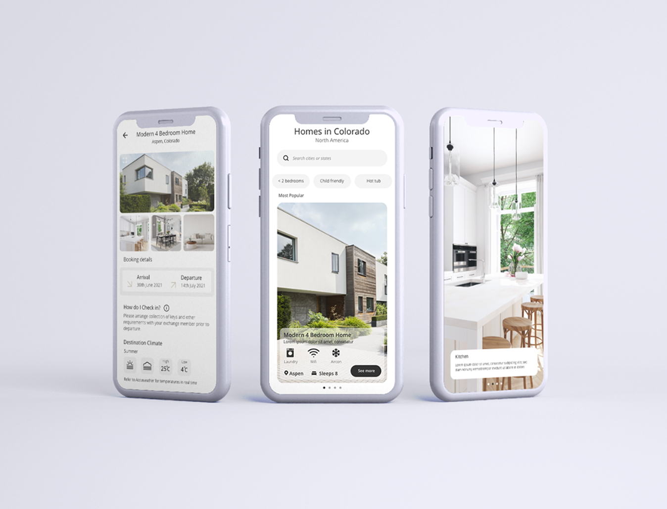
By focusing on user needs and simplifying complex flows, the app turns home exchange into a seamless, confident experience.
That Brings Ideas to Life
Batiste package logo design
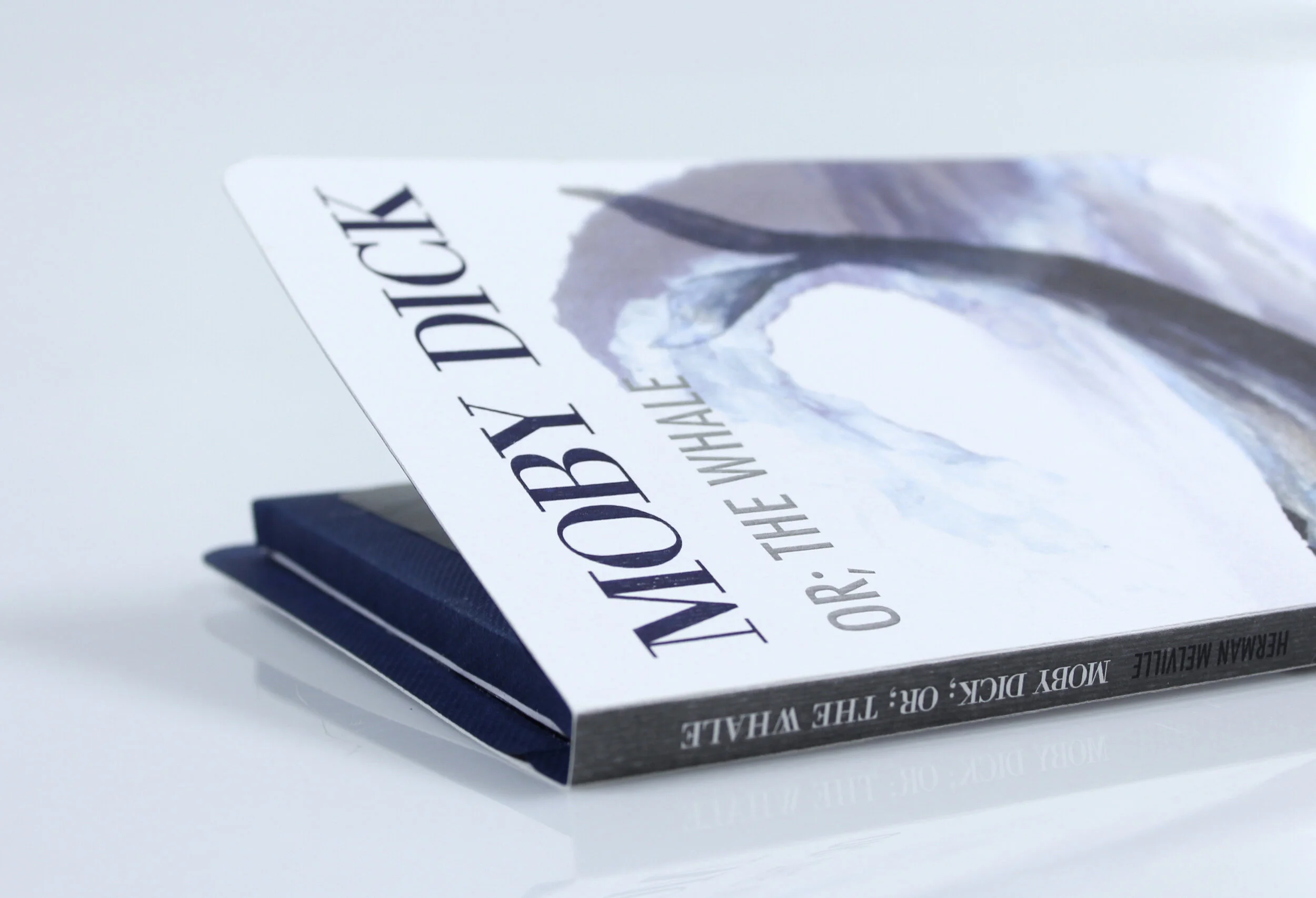
Print media Moby Dick
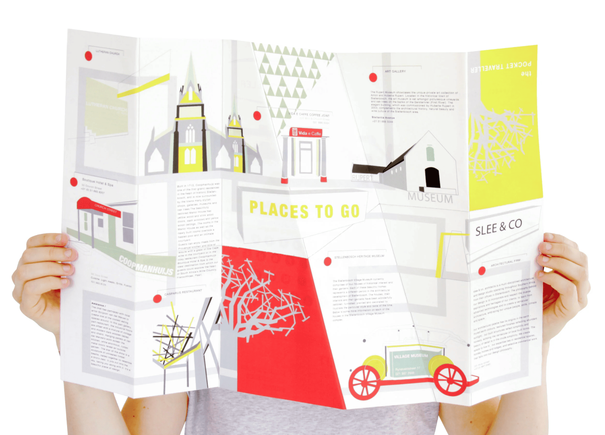
Infographics I love my city
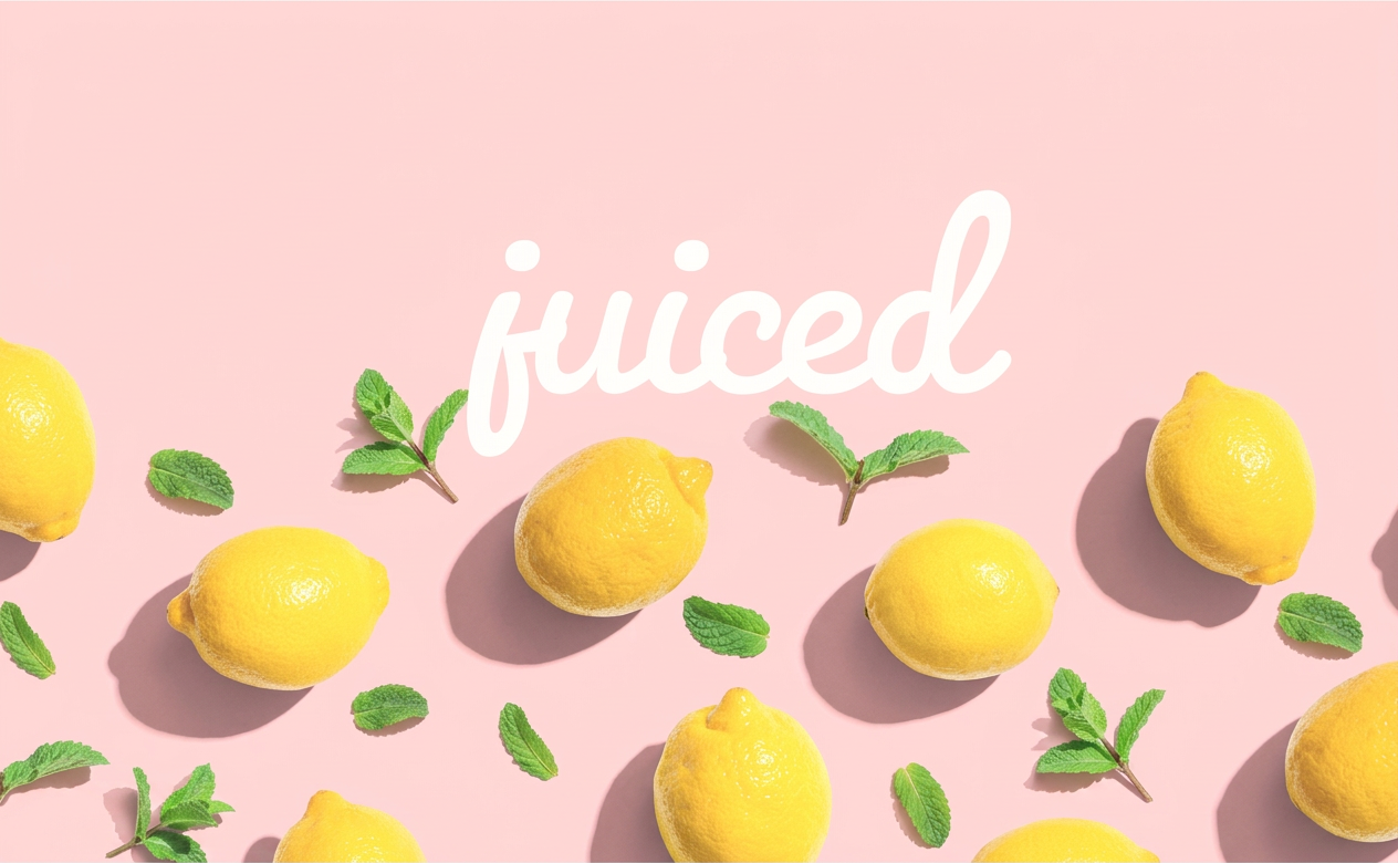
Juiced
Project one
Ecommerce website
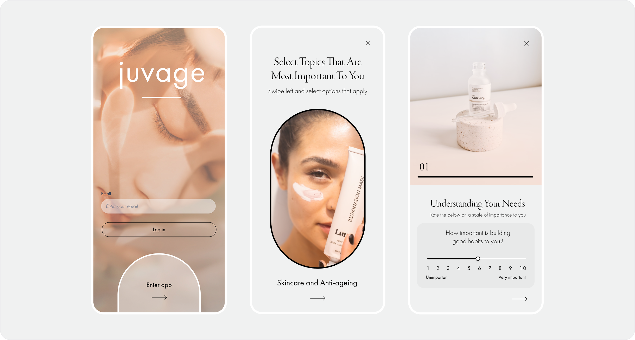
Juvage
UX/UI Mobile Design